Wilkhahn Chairs
Dive into the first phase of our Wilkhahn Revit collaboration, where adaptive forms, custom materials and smart type catalogs combine to deliver stunning, high-performance seating families built for real-world design flexibility.
Wilkhahn Chairs
Dive into the first phase of our Wilkhahn Revit collaboration, where adaptive forms, custom materials and smart type catalogs combine to deliver stunning, high-performance seating families built for real-world design flexibility.

Are you sitting down? What you’re about to see from our Revit content for Wilkhahn's Decide, Yonda and Graph chairs may blow your mind.
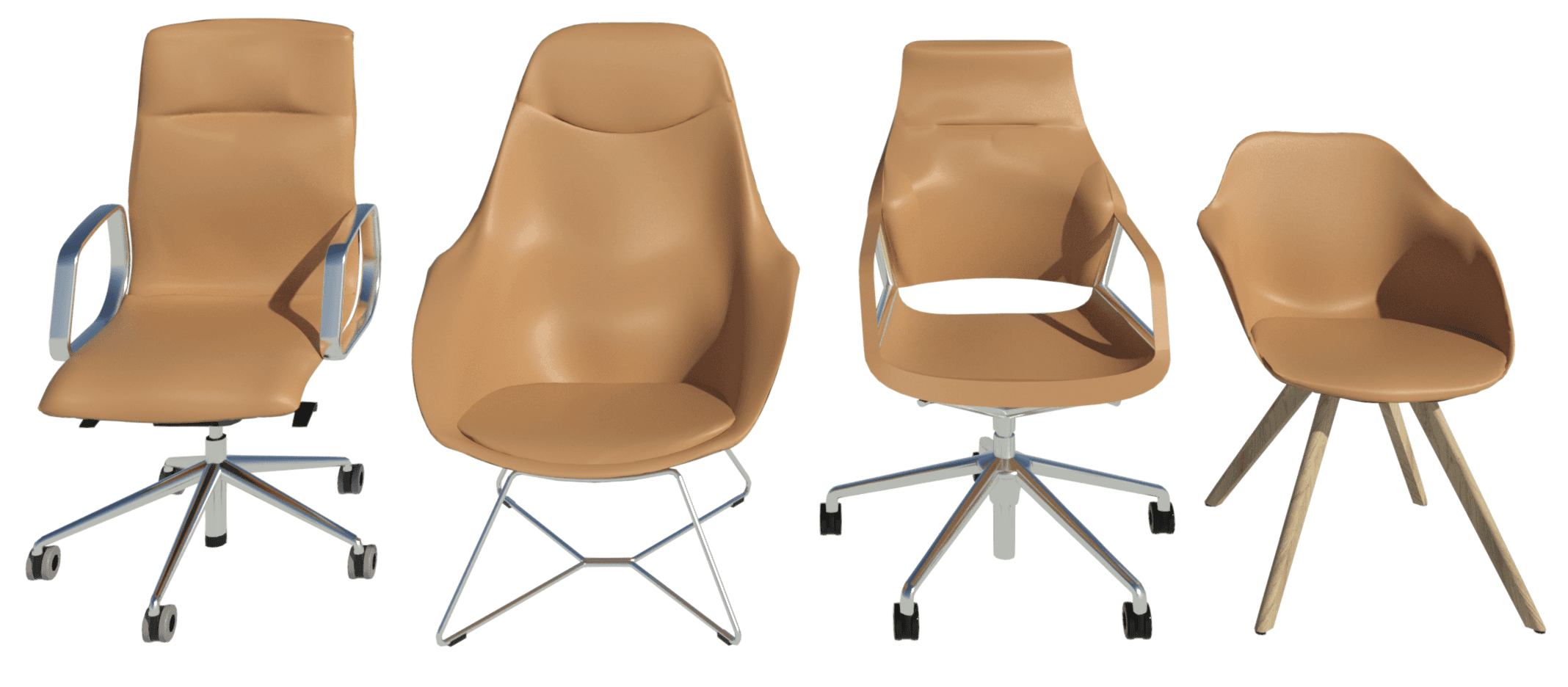
It’s no secret we love to create stylish Revit chair content. Most recently, we’ve been working with Wilkhahn to enhance theirs. It’s an ongoing project with three phases. This first phase involves the Decide, Yonda and Graph chair series.
Wilkhahn
Wilkhahn is an office furniture manufacturer from Germany with over a century of experience. The company is a pioneer not only in office design, but also in setting standards for a socio-ecological approach to office furniture. Wilkhahn has been practicing environmental responsibility for over 20 years, winning the eminent German Environmental Prize in 1996.
Naturally, they are proud of their top-notch products and expect their Revit content to be of the same standard.
Decide Chair
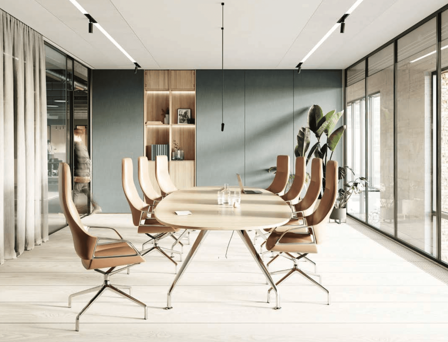
Wilkhahn’s new Decide range of conference chairs combines modern design with ergonomic seating. Notably, the Decide is the first chair in the industry to use high-performance steel. This allows the chair to stimulate muscles in the back without the need for mechanical parts.
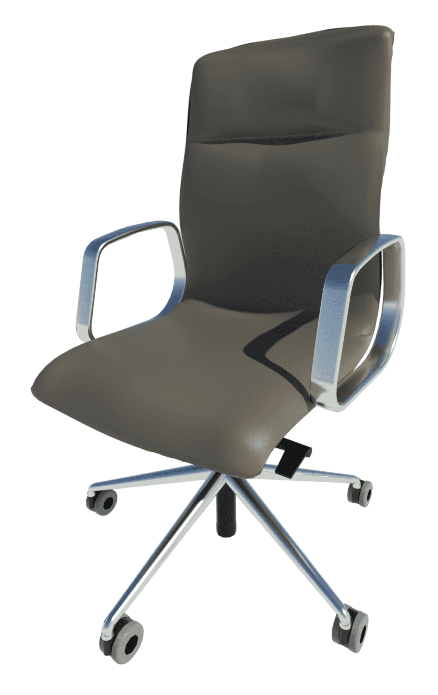
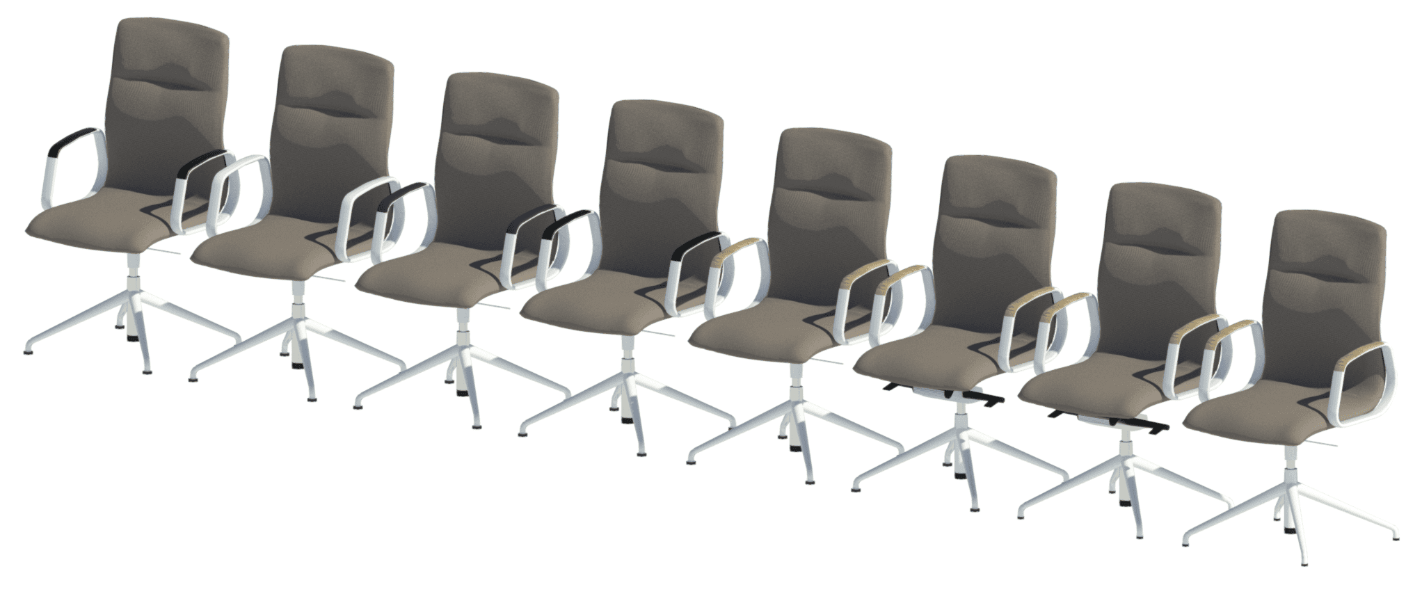
The Decide chair comes in a wide range of models, features and materials, making it an ideal choice for meeting and conference spaces. The standard model offers three varying backrest heights: standard, medium, and high. There are also three different base options: a four-star base, a five-star base with castors, and a five-star base without castors. The seat frame can be supported through a 3D suspension (with either chrome or a standard gas lift) or a manual mechanical adjustment. Finally, the models with glides include options for standard or larger base glides. Most importantly, there are over 230 different materials, which is about 220 more than we wanted to make.
Design Process
The large number of design and material options available for the Decide chair raised some questions about how to best create and split the families covering the range.
While there’s only one Decide chair, the range has to be split into at least three families to suit changing backrest heights. The high backrest, for example, has horizontal indentation and the profiles in the geometry cannot be parametrically controlled to turn this indent on and off. It would be possible to have separate backrest geometries in the same family, but because adaptive components are innately heavy in file size, that approach would result in a huge family of over 5 MB.
It’s important to note that it is not the size of the form that affects the file size. Instead, it’s the number of profiles in the form and what makes up the profile line – for example, the spline and the number of points on the spline. A smaller form may need more profiles to achieve the desired curvature. For this reason, a smaller adaptive form can weigh more than a large one.
These same principles can be applied to the base and frame geometries as well. Even though these are standard forms in Revit, we want to avoid unused geometry in a family.
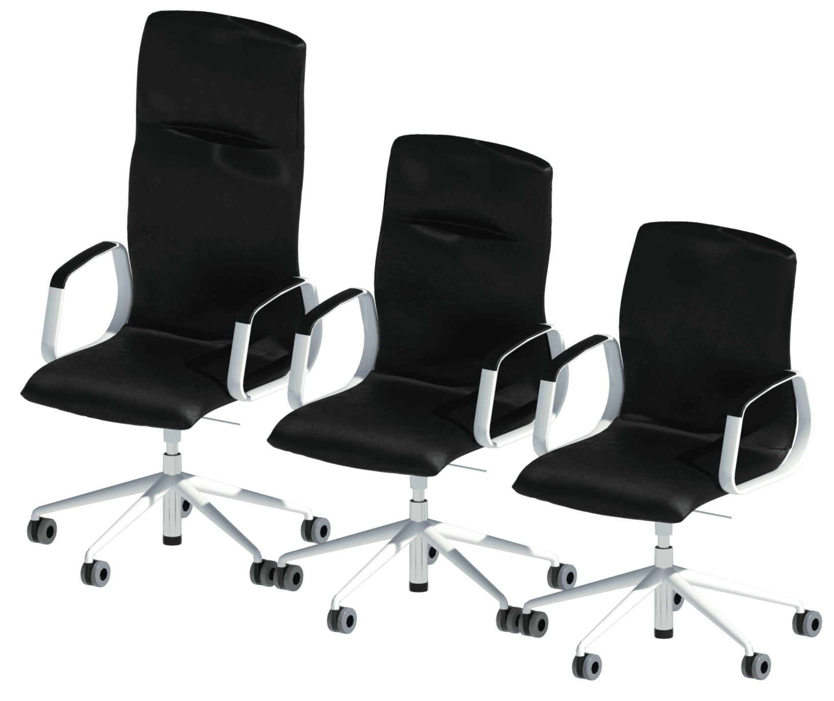
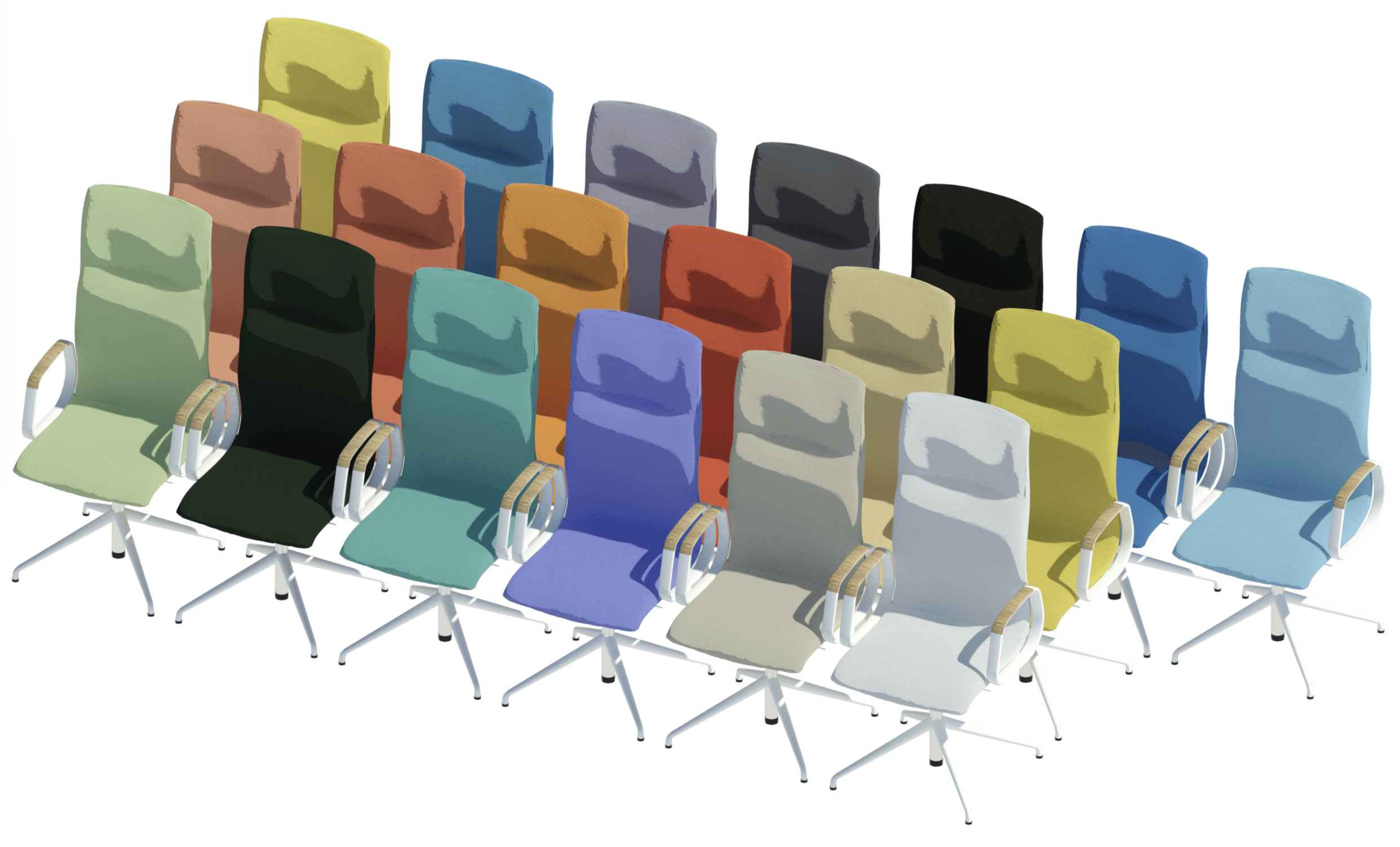
So now we already have six families (3 backrest heights x 2 bases). Meanwhile, the 230 materials available for the Decide are broken down into 14 manufacturer material groups such as Credo, Nova and Morph. If we apply the 14 material groups to those six families, we end up with 84 families. If we then take into account the armrest cover and frame materials, the number of families becomes approximately 600 for what is essentially just one chair!
So we need to strike a balance, which is somewhat subjective, between flexibility and simplicity. We could have 600 families with 46 types each, 300 families with 92 types each, or six families with 4560 types each.
We opted to take the latter approach. While 4560 can look like a scary number at first, Revit’s type catalog is a tool that allows the user to quickly and easily pick the exact type(s) they need. This is why the materials (frame, armrest cover and upholstery) are set as types.
Essentially we use four filtering parameters – frame material, upholstery material group, upholstery color code and armrest cover material – to facilitate finding the type you want. I’ll go into more detail about this in a separate tutorial blog, where I’ll discuss Revit’s type catalog feature and our general ethos towards its use. But you’ll see this same approach reflected in the other Wilkhahn product lines that were part of this project.
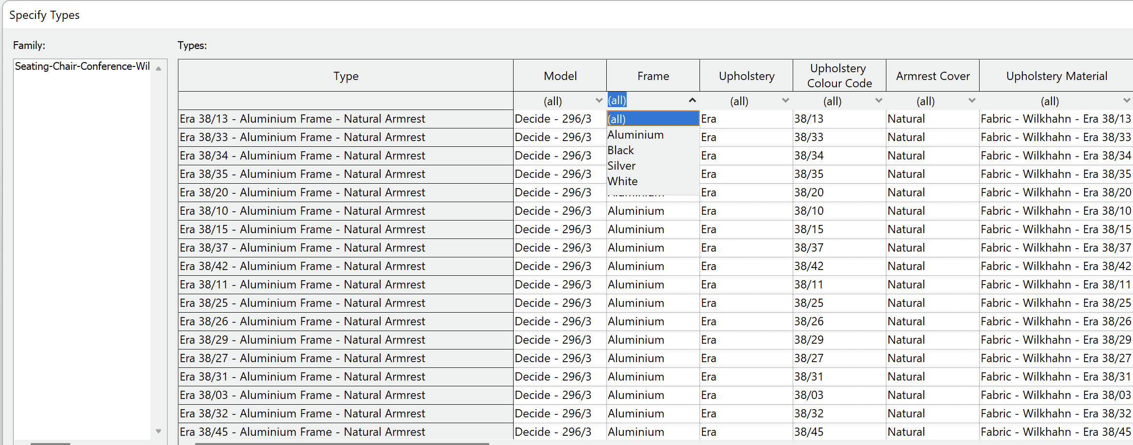
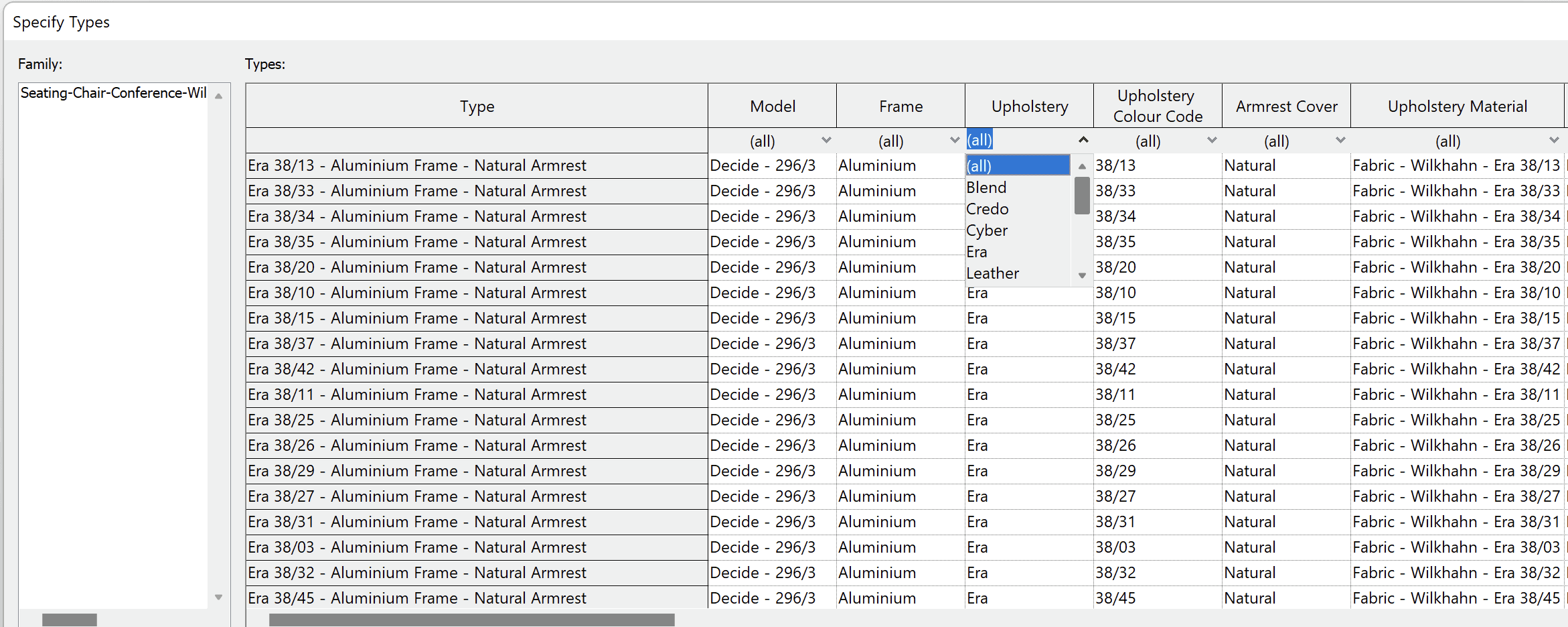
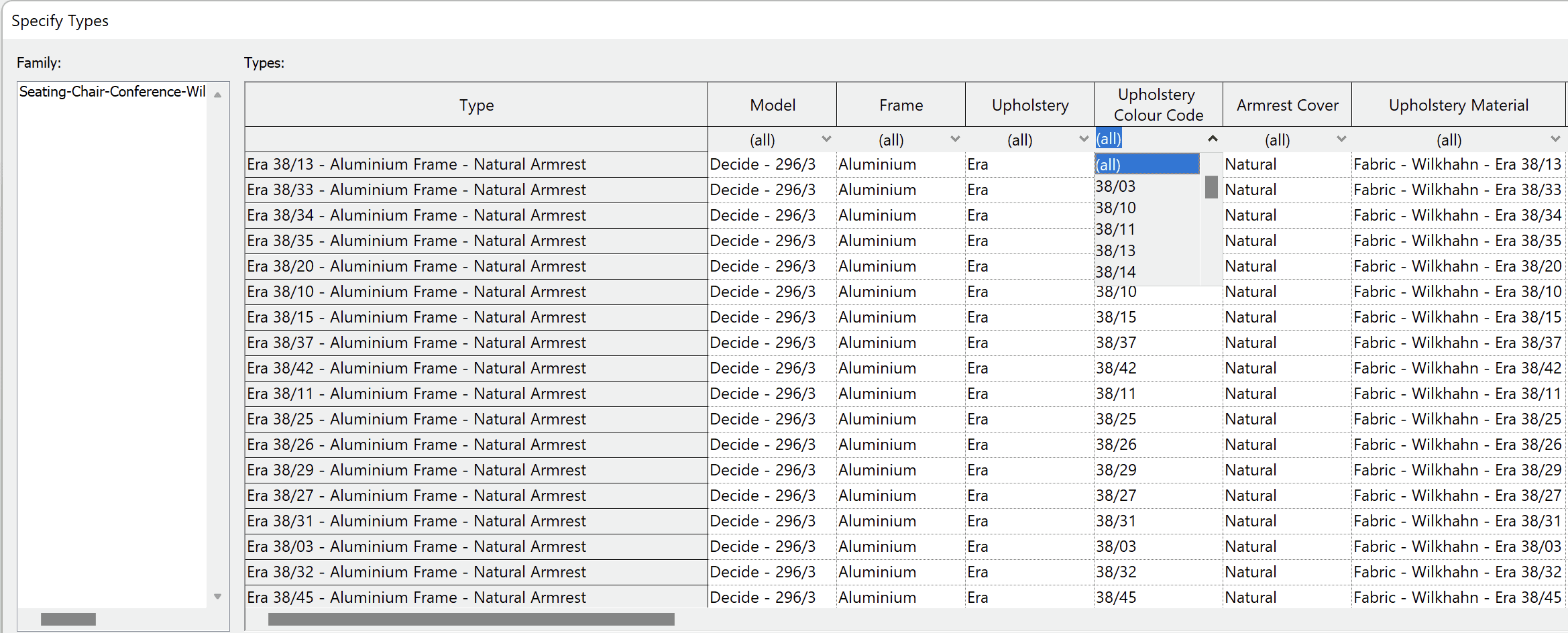
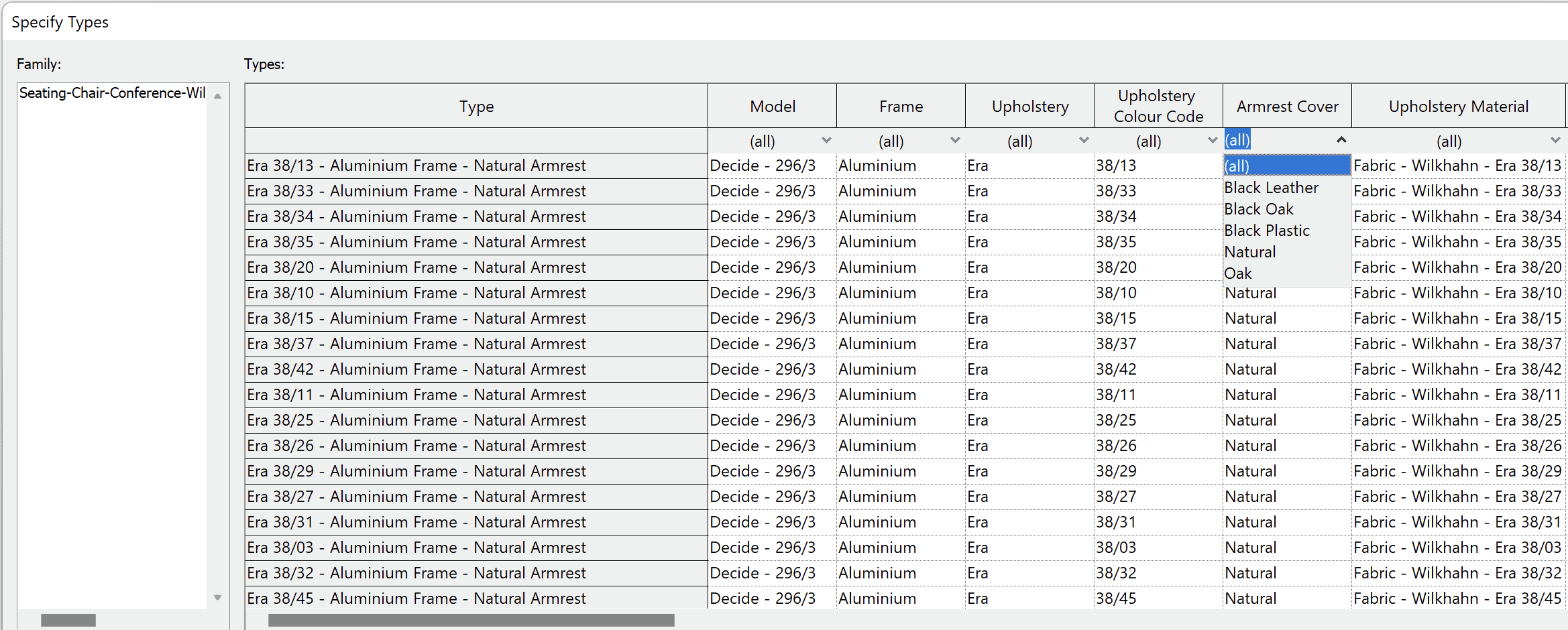
We could have just had the six base families with no materials and a default type. This would simplify the selection process, but ultimately result in a lot more work for the user within a Revit project. After loading the family, the user would have to create a new type with an appropriate name, load the Wilkhahn Material Library file and path the five materials parameters of the chair to the correct materials from a list of 230+. Even if no mistakes are made along the way, this is still a very tedious and technical process.
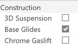
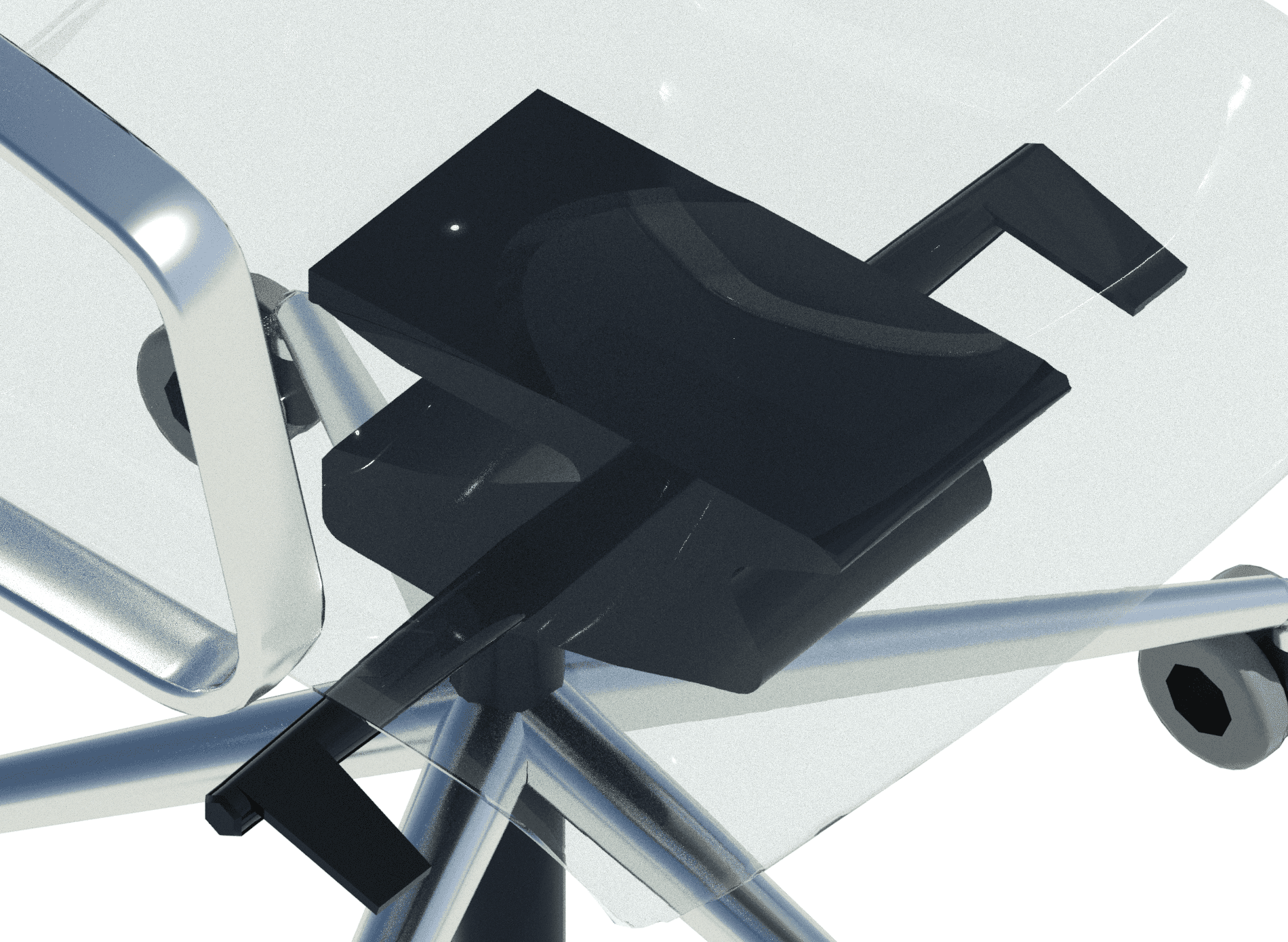
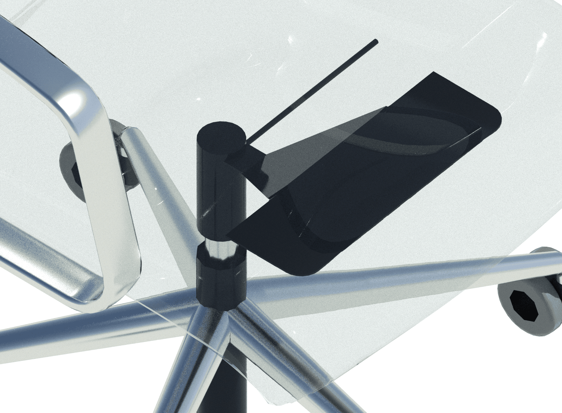
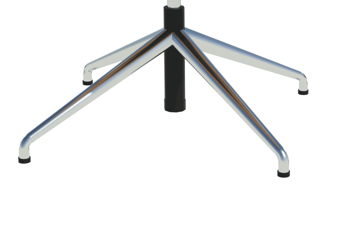
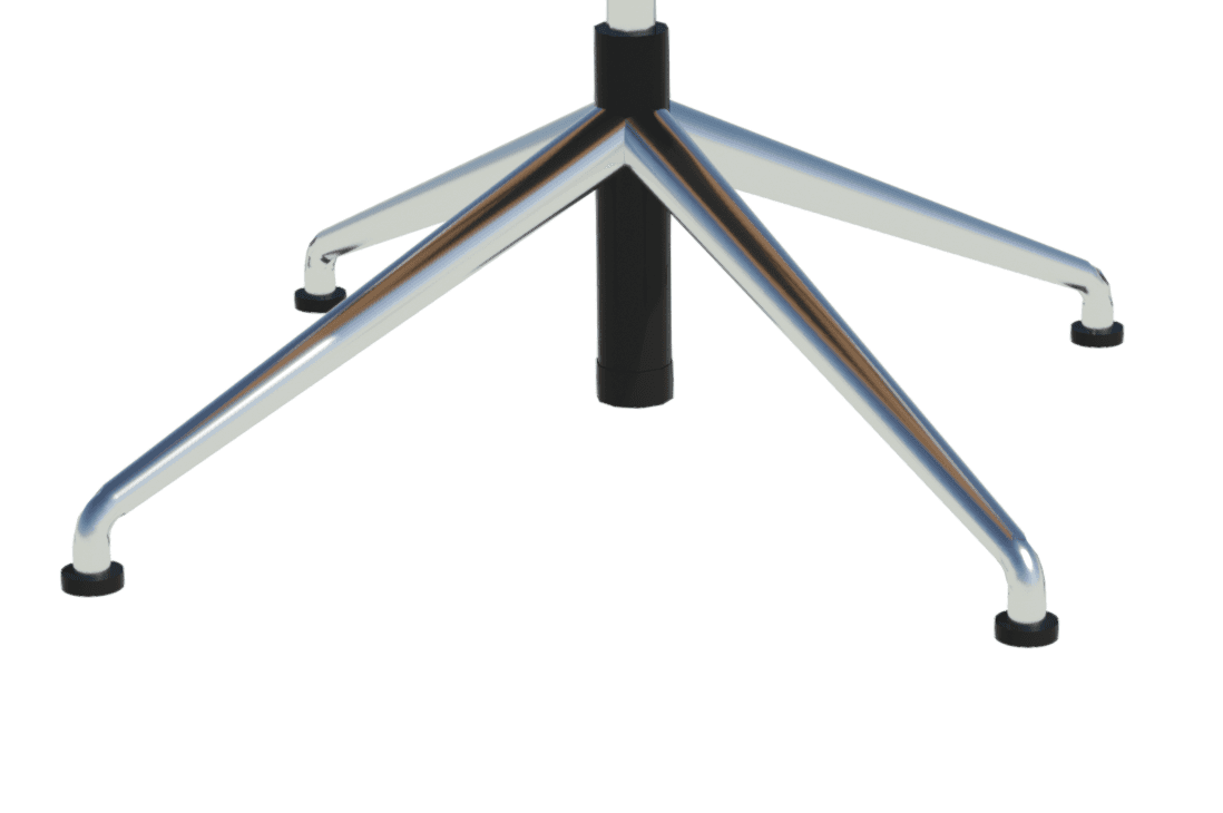
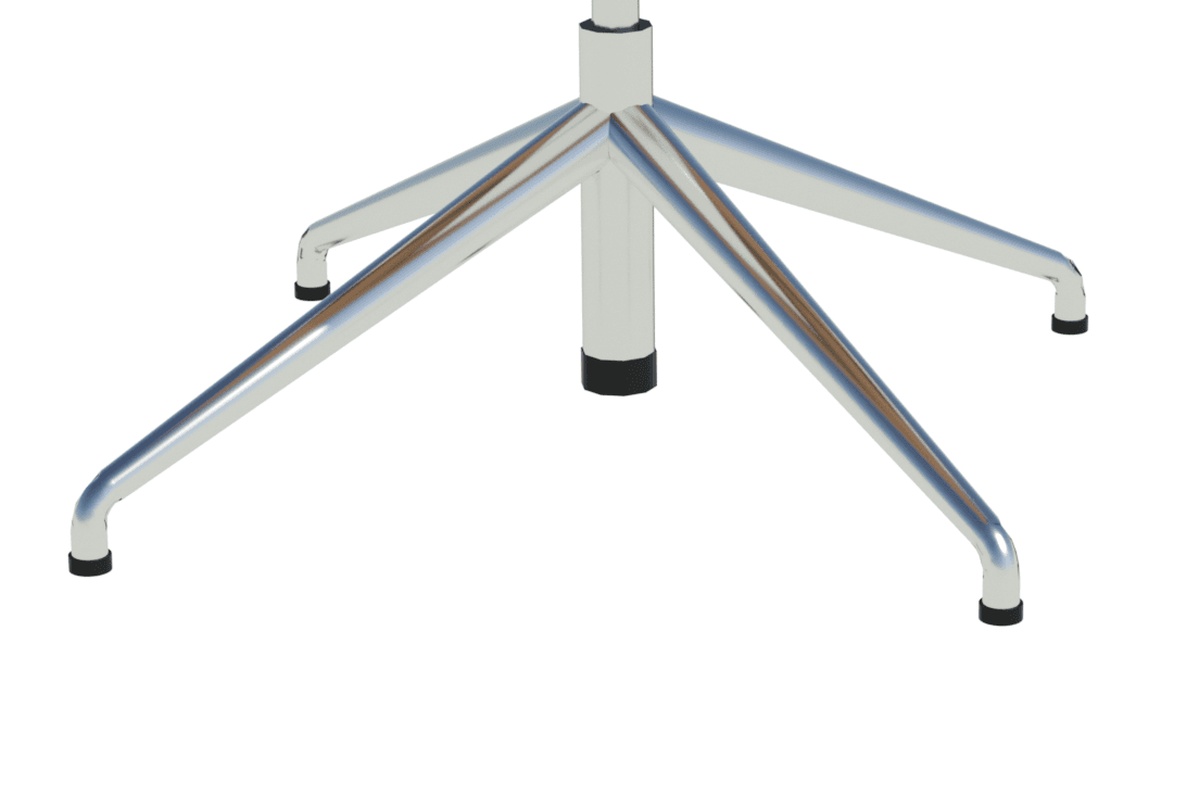
In addition to the breakdown of design options by family and type, we also created three instance-based options. The four-star base with glides is available as standard or base glides. The seat frame can have 3D suspension or an adjustable mechanical lift. Plus the gas lift can be chrome or a standard black finish.
We included these options within the Construction parameters group as shown below. We chose to omit them from the type catalog or family variations because they significantly reduce the number of types/families and can be achieved with no or minimal impact on the file size.
3D and 2D Geometry
As with all of our seating families, there are three levels of detail – coarse, medium and fine. We also utilize 2D geometry only for the plan view. This ensures a faster workflow in a Revit project plan view for placement and spatial design.
Materials
We are well versed with custom materials and, personally, I’m a big fan of a well-crafted material that thinks outside the box to deliver more than a standard OOTB effect. We’ve published some blogs on this in the past and have even discussed how materials can replace geometry detail. As mentioned, Wilkhahn has 14 different material groups that then come in multiple colors. I didn’t realize the scale of this when quoting for the project, and I’ll always remember the moment when it dawned on me how deep the material rabbit hole goes.

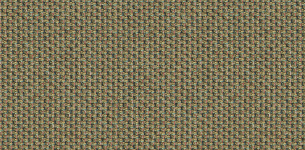
We couldn’t use customer sample images due to the pattern repeating. Each material group had to be distinct and custom-made. We’ll discuss the details at a later date, but these are easily some of the best (and most labor-intensive) materials we’ve ever made.
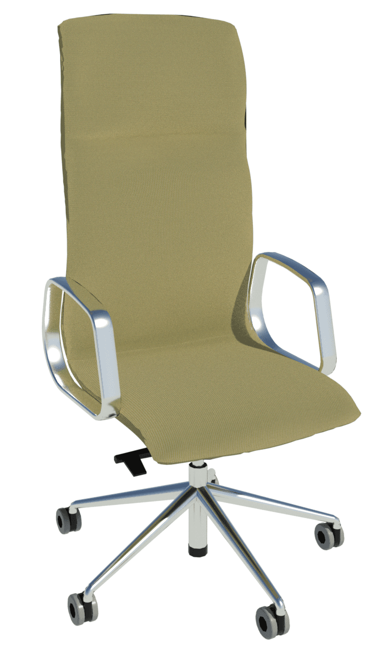
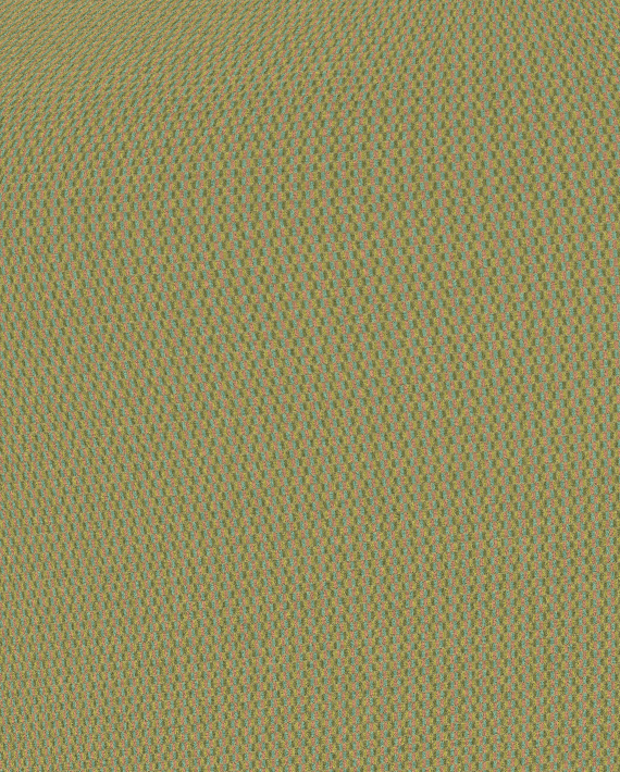
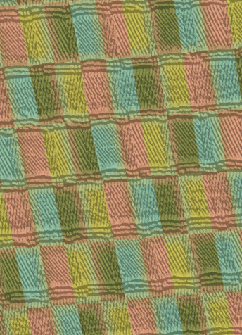
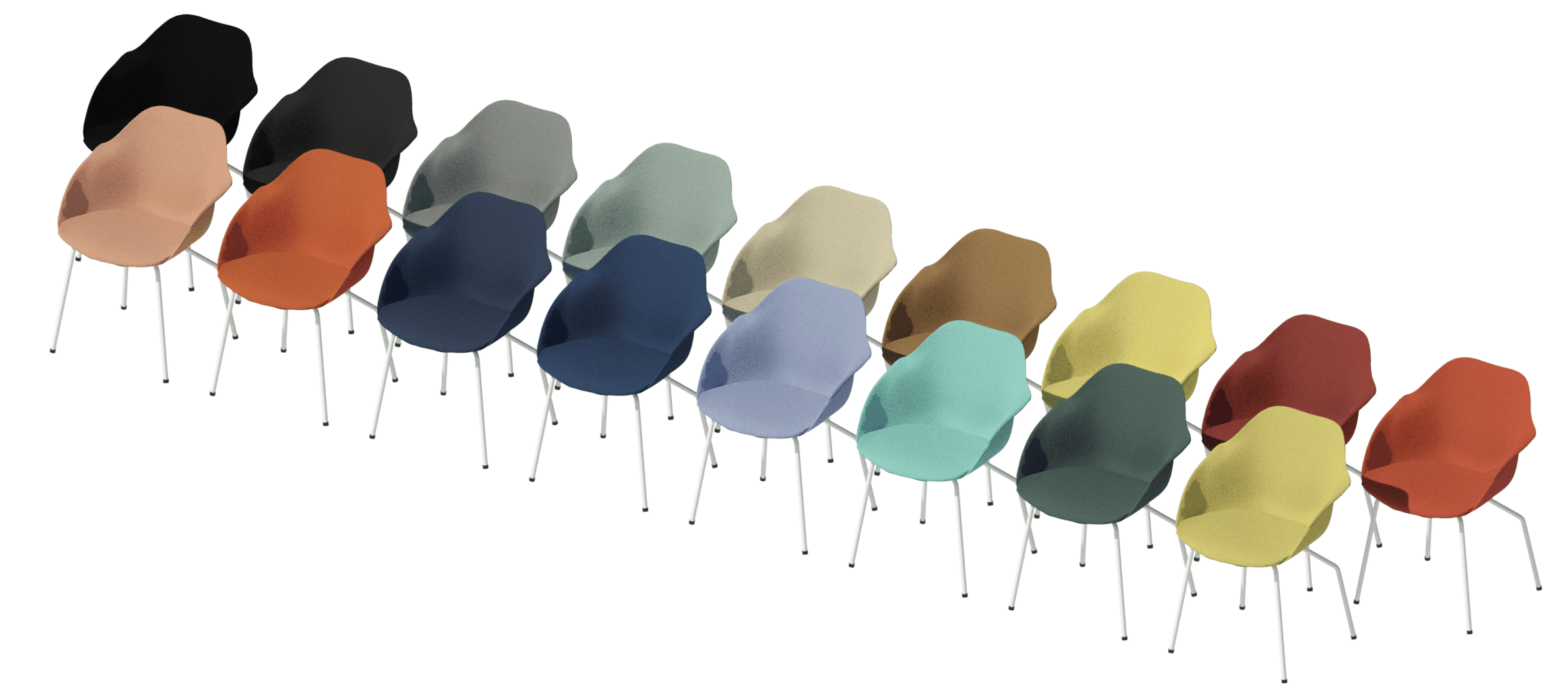
As an example, let’s look at Wilkhahn’s Cyber material, which is similar to a rough tweed woven with four different colors. We essentially ended up making our own Revit tweed.
Yonda Range
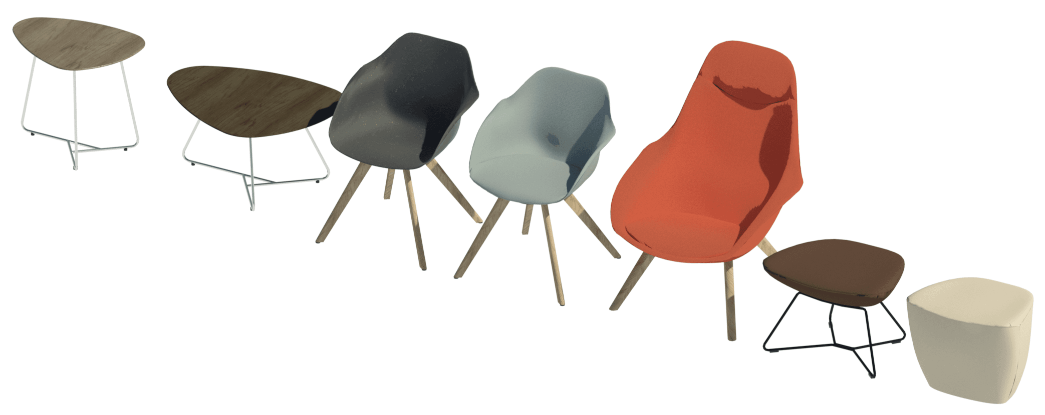
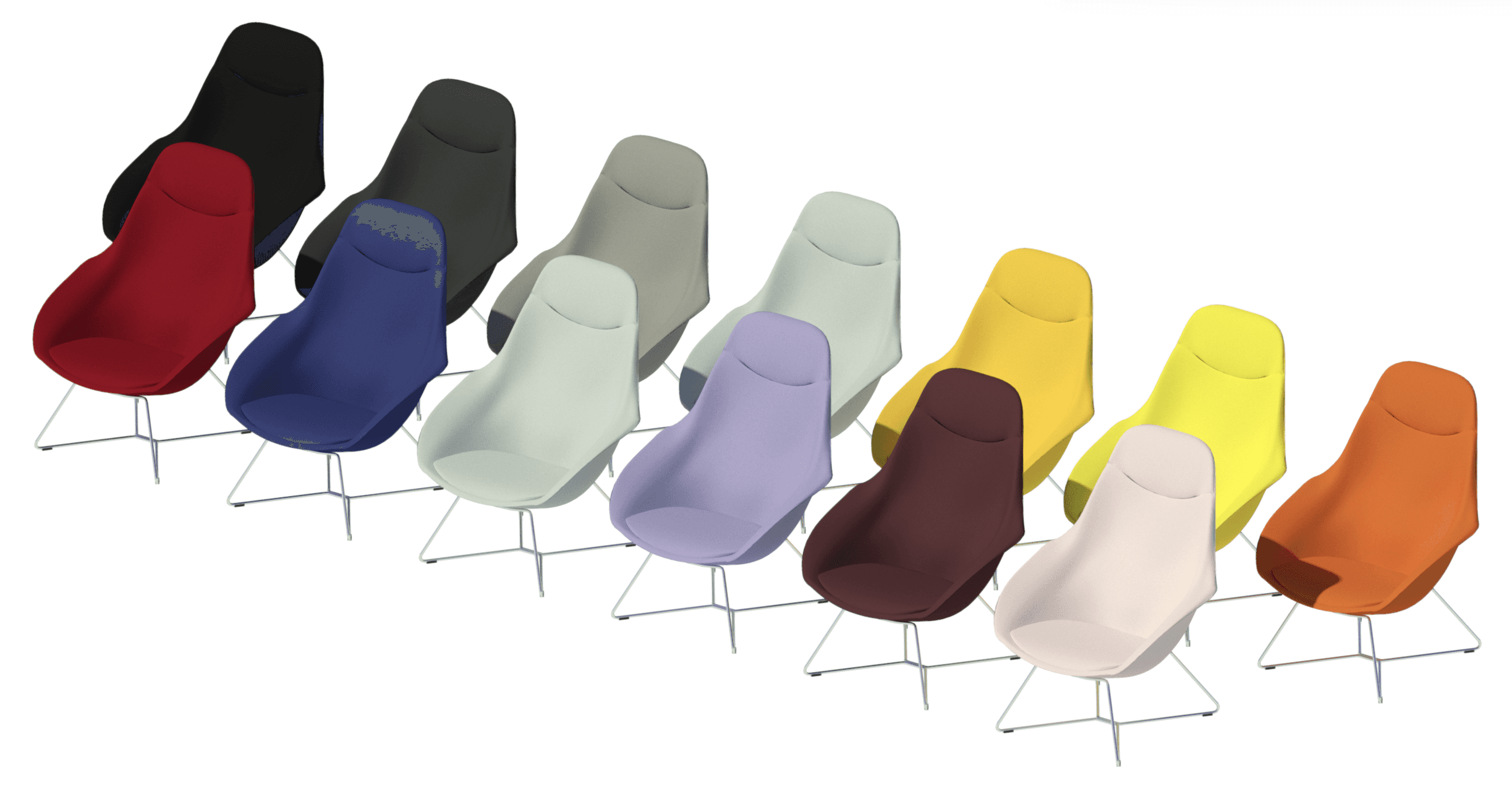
Yonda stems from “beyond” because this piece of furniture really goes that extra mile. Neunzig° Design Studio reinterpreted the archetypal, spacious shell-structure chair to craft an innovative range that meets the needs of today’s and tomorrow’s world. The Yonda range includes the Yonda chair, conference chair, lounge chair, lounge ottoman, stool and two tables.
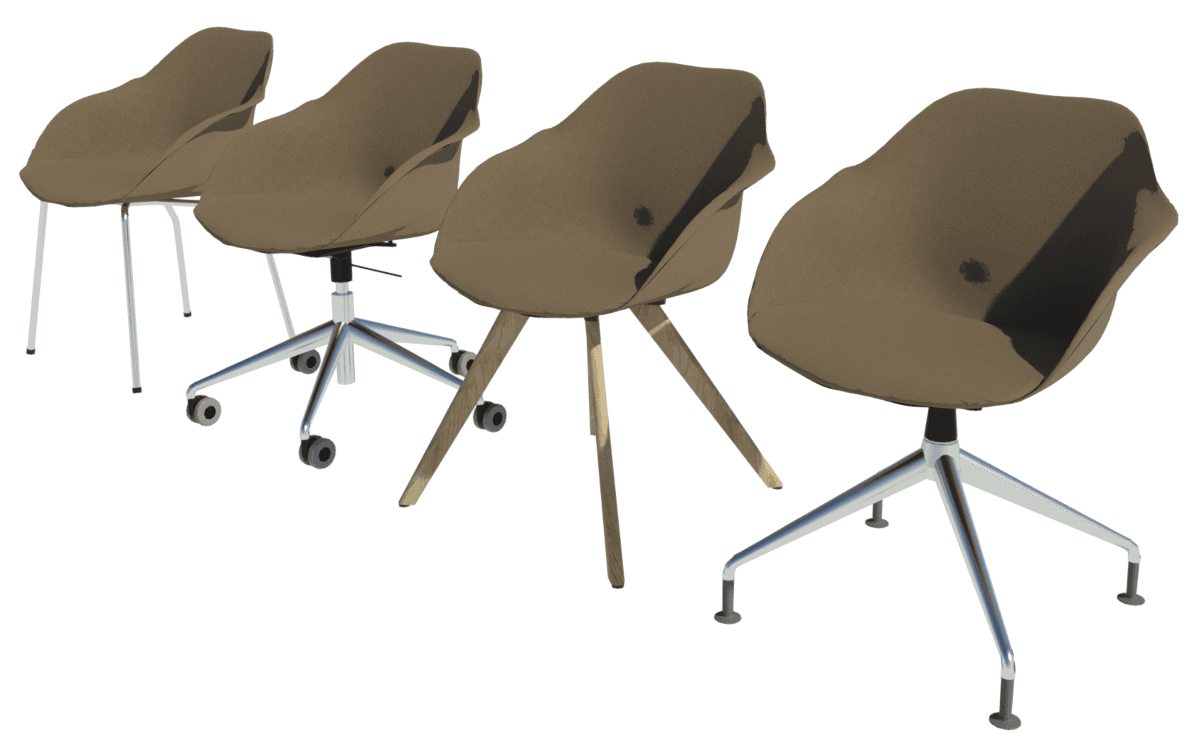
Yonda chairs include various base designs such as oak tapered, tubular, four-star base and five-star base with castors. Ranging from 36 to 9500+ types defined by base color and upholstery, the families are always driven by type catalog to allow for a quick selection process.

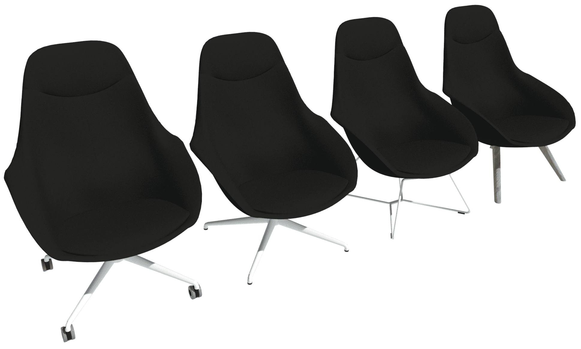
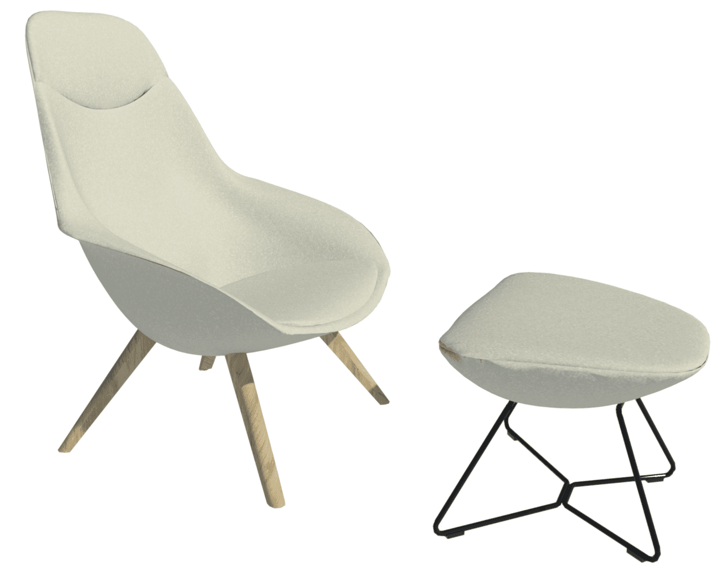
The Yonda lounge chair is available with four bases: tapered, four-star, four-star with castors and sled base. The Yonda lounge chair Revit families have up to 684 types to match the choices in frame color and upholstery.
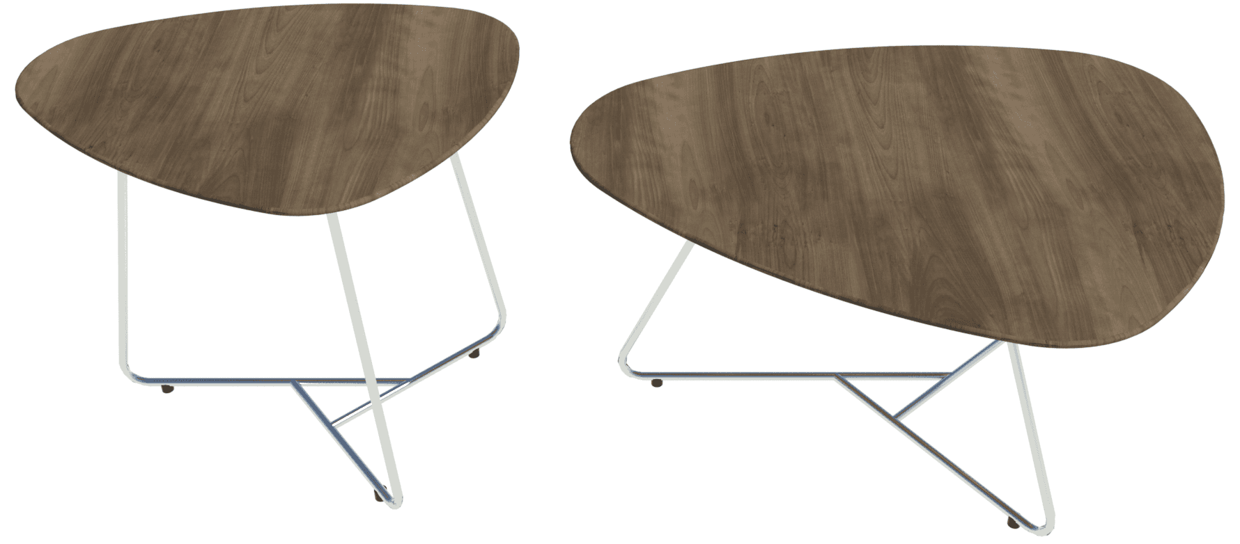
The Yonda tables, both small and large, have 70 types driven by type catalog. These cover the various table materials (e.g. laminate, veneer or bonded composite), frame material, color and the table edge as either chamfered or standard.
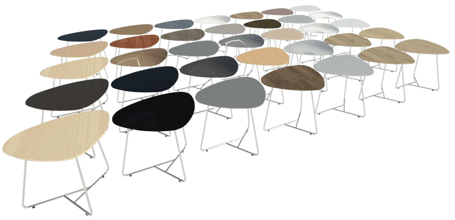
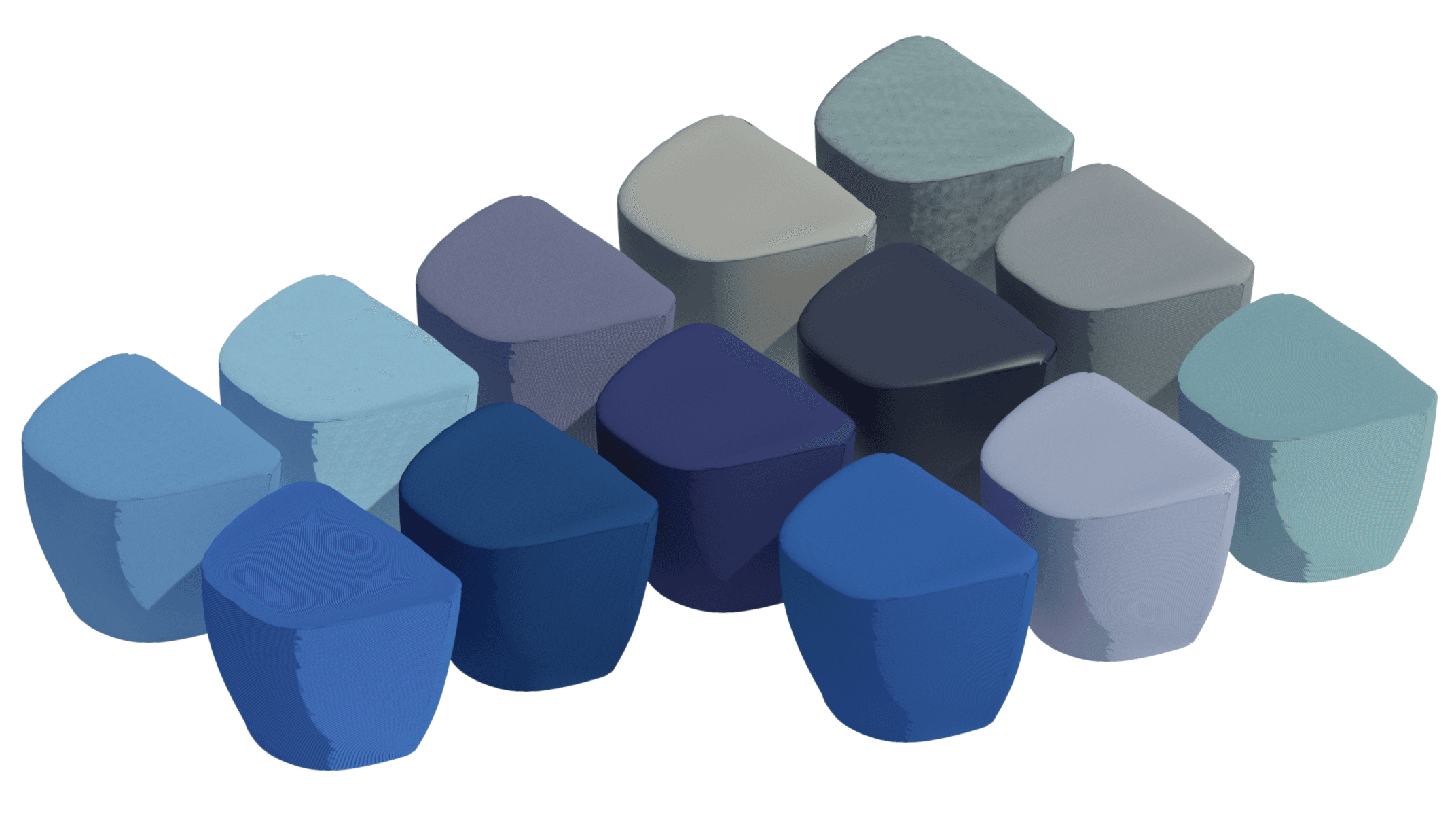
The Yonda lounge stool has 228 types defined by the materials. The Yonda lounge ottoman has 684 types that cover the same materials as well as three different frame colors. All types are driven by type catalog to reduce unnecessary loading of types into a project and to facilitate a quick type selection.
Graph Chair
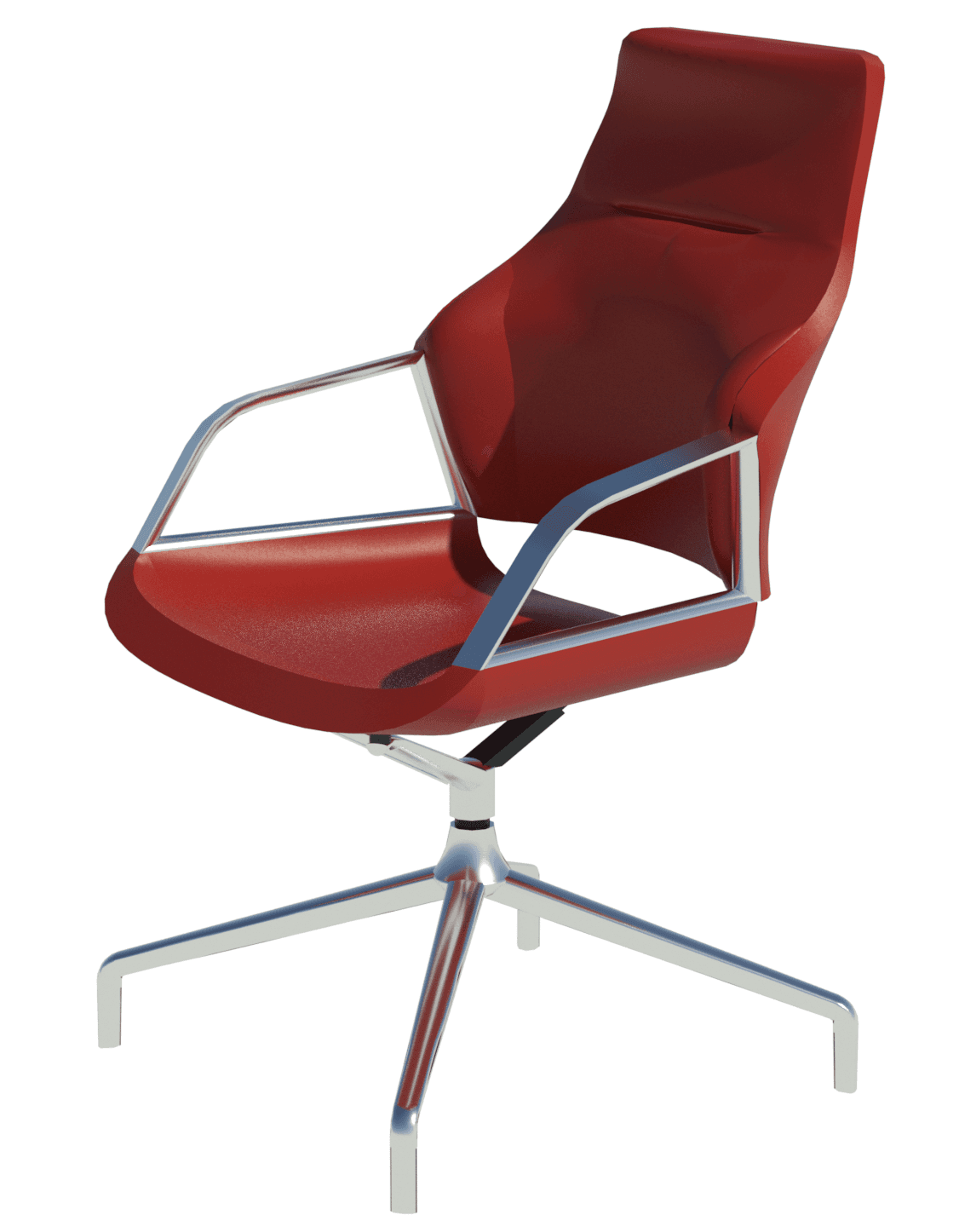
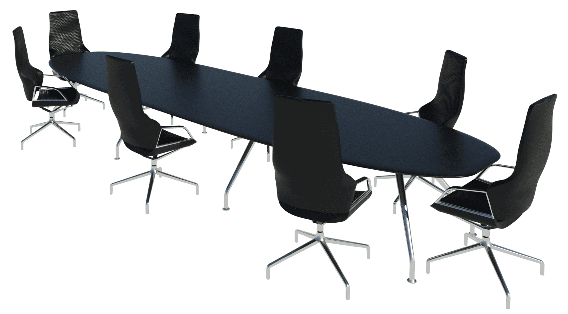
The Graph chair is the ideal choice when superior comfort and uncompromising quality are required. The name of the range, designed by Markus Jehs and Jürgen Laub, refers to its graphical aesthetic. It is exactly this feature that the chair owes its name to: the seat shell is cut through horizontally and vertically and then reassembled.
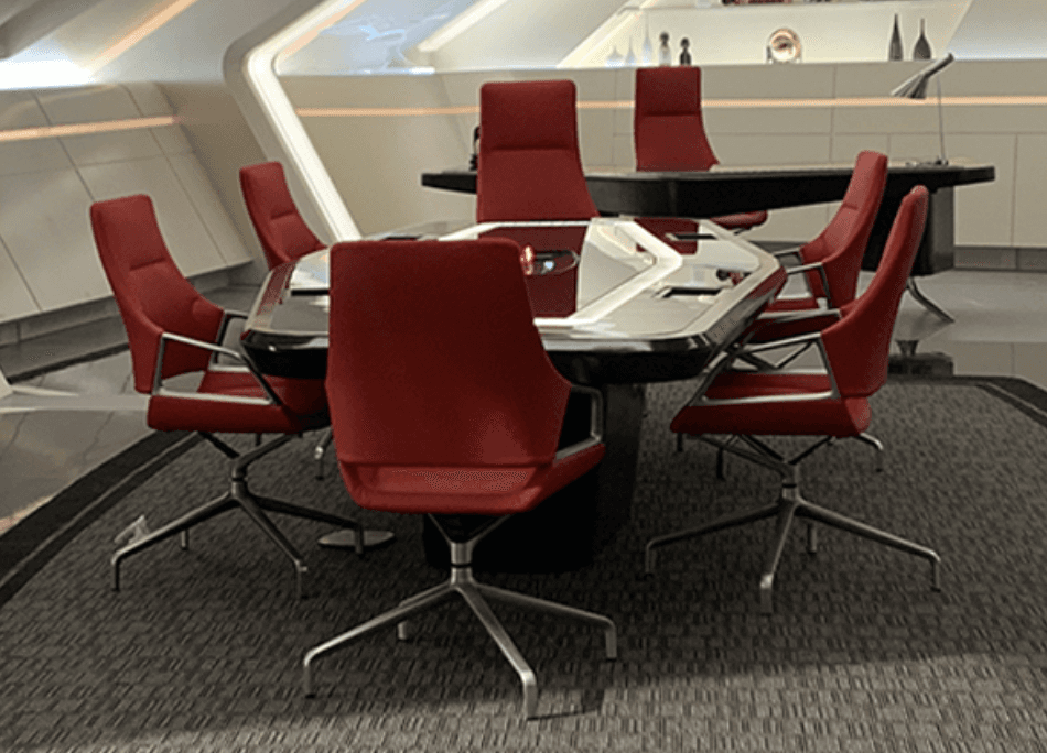
You might recognize it from the new Star Trek series (Strange New Worlds) on Paramount. I only started watching this series after working with Wilkhahn, but then I forgot to cancel the free subscription. So, weirdly, this project has cost me £7.99.
The standard Graph chair has been split into eight families to suit the two different backrest heights and four bases (four-star, four-star with castors, five-star with castors, and five-star with castors and rocking). Each family has just over 1000 types to suit frame color, material and upholstery material.
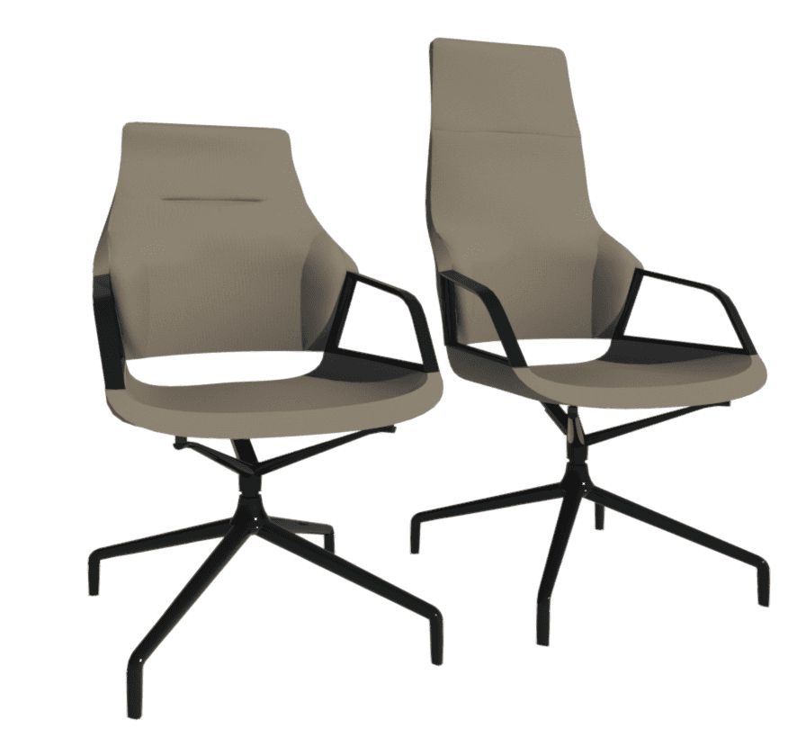

This was the first chair we created and blogged about back in 2023. It was already an improvement on Wilkhahn’s existing content, but we didn't want to rest on our laurels, especially when it’s their iconic and flagship product. Plus, we now had access to more information and detailed DWGs that could be imported and sliced, so that we could match our adaptive form profiles to DWGs.
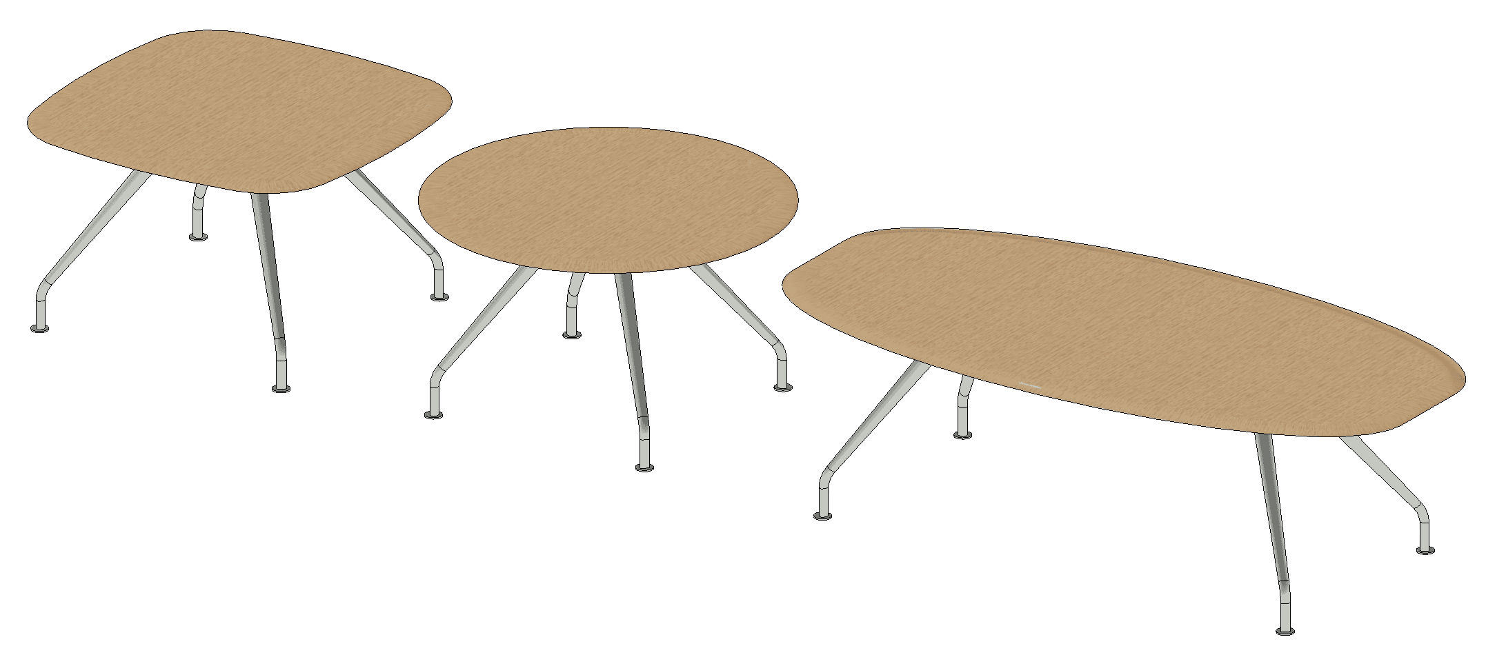
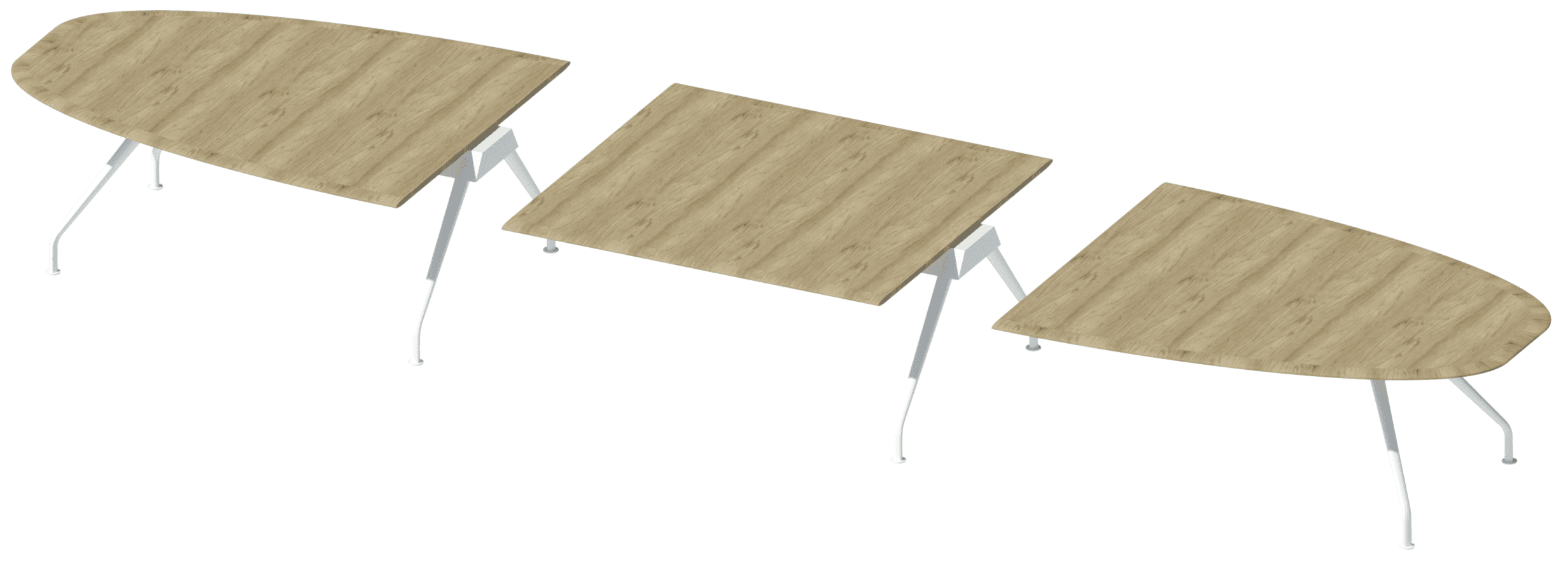
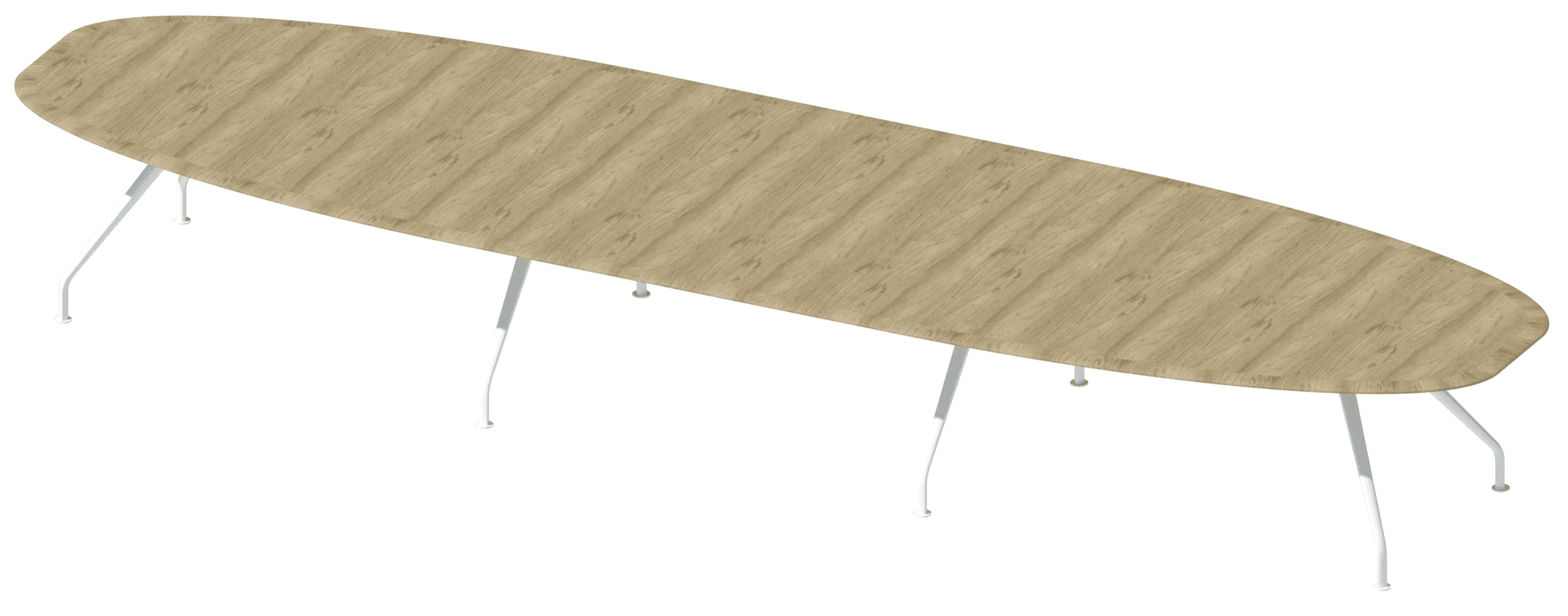
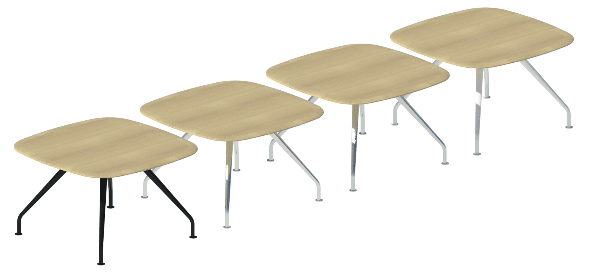
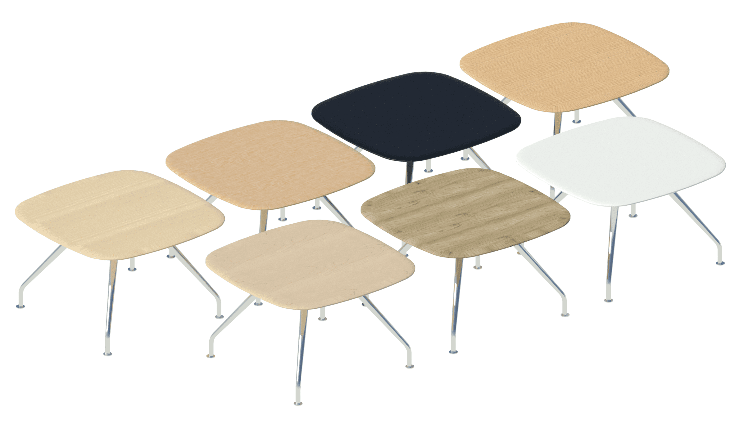
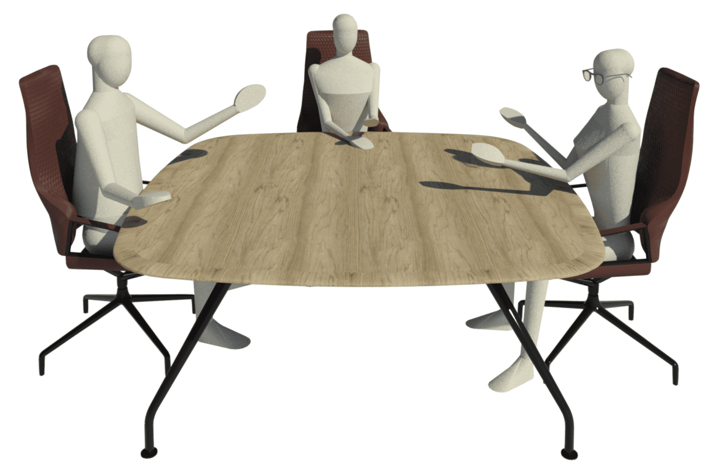
The Graph ranges also include multiple tables available in various sizes – round, square and oval. On top of this, modular oval table segments where the start, middle and finish can be manually selected to create specific variations.


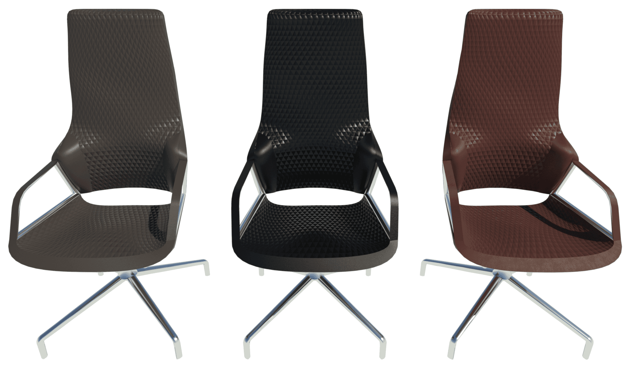
Lastly, the Graph range includes the Graph Iconic chairs. These are similar to the standard model, but embossed in diamond relief leather materials.
Conclusion
We don’t assume to have all the answers when it comes to creating perfect Revit content. With manufacturer content in particular, it’s important to take a wider view of the intended purpose. At the end of the day, we need to support both the manufacturer and the end user by offering all of the variations available – with as few clicks of the mouse as possible, without hindering project performance, and yet maintaining high visual standards.
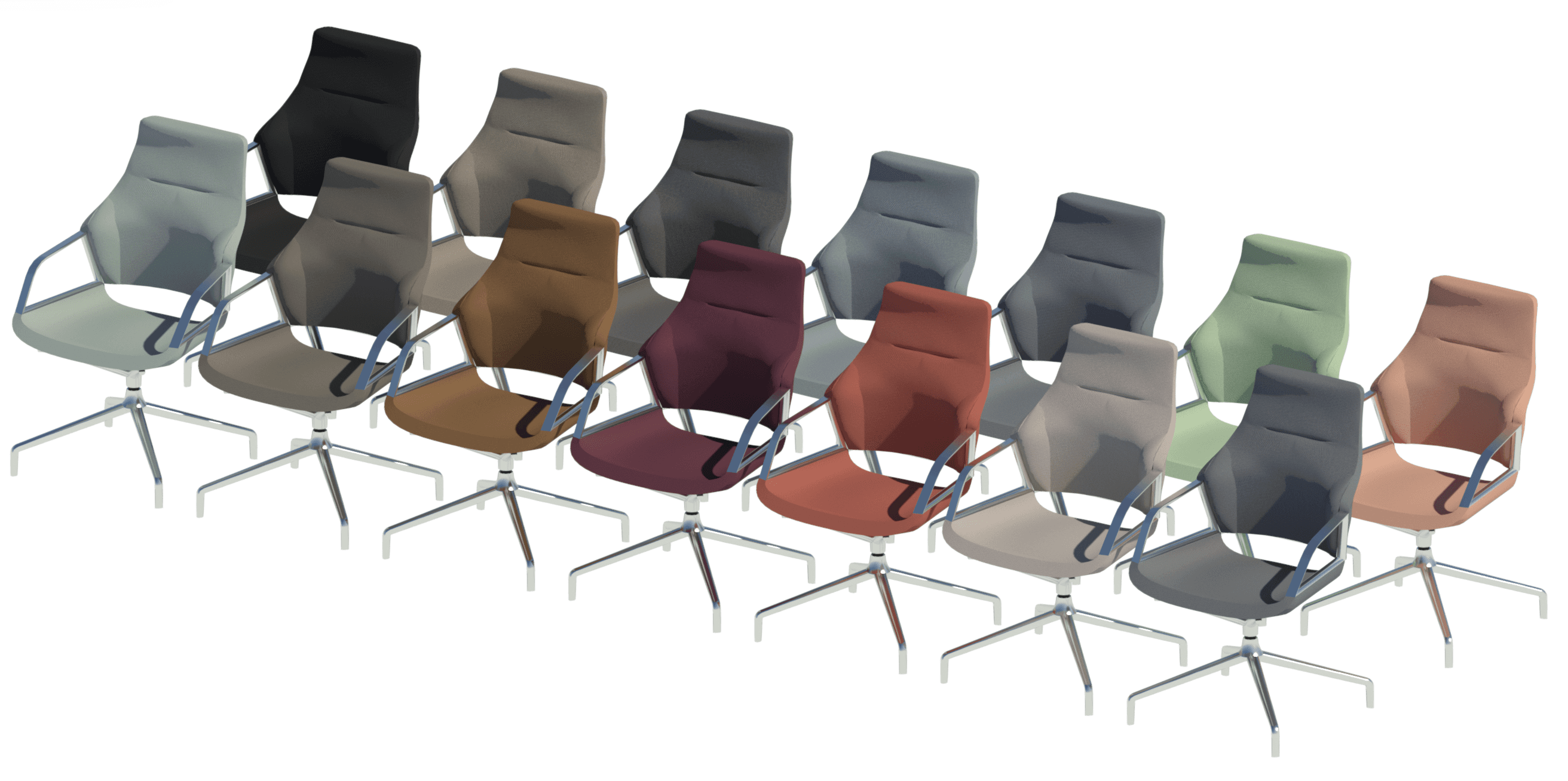
If you’re still reading, then thanks for your time! We’ve really tried to push the boundaries of Revit here. These chairs are unparalleled in their aesthetics, not only due to their adaptive component forms, but also due to the attention to detail with materials. This project has also helped us re-evaluate the use of type catalogs for Revit families and how best to enhance the selection process. I humbly believe these to now be the best Revit chairs out there, and would encourage you to reach out to Wilkhahn to give them a try. Enjoy the rest of the images!


Are you sitting down? What you’re about to see from our Revit content for Wilkhahn's Decide, Yonda and Graph chairs may blow your mind.
It’s no secret we love to create stylish Revit chair content. Most recently, we’ve been working with Wilkhahn to enhance theirs. It’s an ongoing project with three phases. This first phase involves the Decide, Yonda and Graph chair series.

Wilkhahn
Wilkhahn is an office furniture manufacturer from Germany with over a century of experience. The company is a pioneer not only in office design, but also in setting standards for a socio-ecological approach to office furniture. Wilkhahn has been practicing environmental responsibility for over 20 years, winning the eminent German Environmental Prize in 1996.
Naturally, they are proud of their top-notch products and expect their Revit content to be of the same standard.

Decide Chair
Wilkhahn’s new Decide range of conference chairs combines modern design with ergonomic seating. Notably, the Decide is the first chair in the industry to use high-performance steel. This allows the chair to stimulate muscles in the back without the need for mechanical parts.

The Decide chair comes in a wide range of models, features and materials, making it an ideal choice for meeting and conference spaces. The standard model offers three varying backrest heights: standard, medium, and high. There are also three different base options: a four-star base, a five-star base with castors, and a five-star base without castors. The seat frame can be supported through a 3D suspension (with either chrome or a standard gas lift) or a manual mechanical adjustment. Finally, the models with glides include options for standard or larger base glides. Most importantly, there are over 230 different materials, which is about 220 more than we wanted to make.

Design Process
The large number of design and material options available for the Decide chair raised some questions about how to best create and split the families covering the range.
While there’s only one Decide chair, the range has to be split into at least three families to suit changing backrest heights. The high backrest, for example, has horizontal indentation and the profiles in the geometry cannot be parametrically controlled to turn this indent on and off. It would be possible to have separate backrest geometries in the same family, but because adaptive components are innately heavy in file size, that approach would result in a huge family of over 5 MB.
It’s important to note that it is not the size of the form that affects the file size. Instead, it’s the number of profiles in the form and what makes up the profile line – for example, the spline and the number of points on the spline. A smaller form may need more profiles to achieve the desired curvature. For this reason, a smaller adaptive form can weigh more than a large one.
These same principles can be applied to the base and frame geometries as well. Even though these are standard forms in Revit, we want to avoid unused geometry in a family.

So now we already have six families (3 backrest heights x 2 bases). Meanwhile, the 230 materials available for the Decide are broken down into 14 manufacturer material groups such as Credo, Nova and Morph. If we apply the 14 material groups to those six families, we end up with 84 families. If we then take into account the armrest cover and frame materials, the number of families becomes approximately 600 for what is essentially just one chair!
So we need to strike a balance, which is somewhat subjective, between flexibility and simplicity. We could have 600 families with 46 types each, 300 families with 92 types each, or six families with 4560 types each.
We opted to take the latter approach. While 4560 can look like a scary number at first, Revit’s type catalog is a tool that allows the user to quickly and easily pick the exact type(s) they need. This is why the materials (frame, armrest cover and upholstery) are set as types.
Essentially we use four filtering parameters – frame material, upholstery material group, upholstery color code and armrest cover material – to facilitate finding the type you want. I’ll go into more detail about this in a separate tutorial blog, where I’ll discuss Revit’s type catalog feature and our general ethos towards its use. But you’ll see this same approach reflected in the other Wilkhahn product lines that were part of this project.


We could have just had the six base families with no materials and a default type. This would simplify the selection process, but ultimately result in a lot more work for the user within a Revit project. After loading the family, the user would have to create a new type with an appropriate name, load the Wilkhahn Material Library file and path the five materials parameters of the chair to the correct materials from a list of 230+. Even if no mistakes are made along the way, this is still a very tedious and technical process.
In addition to the breakdown of design options by family and type, we also created three instance-based options. The four-star base with glides is available as standard or base glides. The seat frame can have 3D suspension or an adjustable mechanical lift. Plus the gas lift can be chrome or a standard black finish.
We included these options within the Construction parameters group as shown below. We chose to omit them from the type catalog or family variations because they significantly reduce the number of types/families and can be achieved with no or minimal impact on the file size.


3D and 2D Geometry
As with all of our seating families, there are three levels of detail – coarse, medium and fine. We also utilize 2D geometry only for the plan view. This ensures a faster workflow in a Revit project plan view for placement and spatial design.
Materials
We are well versed with custom materials and, personally, I’m a big fan of a well-crafted material that thinks outside the box to deliver more than a standard OOTB effect. We’ve published some blogs on this in the past and have even discussed how materials can replace geometry detail. As mentioned, Wilkhahn has 14 different material groups that then come in multiple colors. I didn’t realize the scale of this when quoting for the project, and I’ll always remember the moment when it dawned on me how deep the material rabbit hole goes.

We couldn’t use customer sample images due to the pattern repeating. Each material group had to be distinct and custom-made. We’ll discuss the details at a later date, but these are easily some of the best (and most labor-intensive) materials we’ve ever made.
As an example, let’s look at Wilkhahn’s Cyber material, which is similar to a rough tweed woven with four different colors. We essentially ended up making our own Revit tweed.


Yonda Range
Yonda stems from “beyond” because this piece of furniture really goes that extra mile. Neunzig° Design Studio reinterpreted the archetypal, spacious shell-structure chair to craft an innovative range that meets the needs of today’s and tomorrow’s world. The Yonda range includes the Yonda chair, conference chair, lounge chair, lounge ottoman, stool and two tables.

Yonda chairs include various base designs such as oak tapered, tubular, four-star base and five-star base with castors. Ranging from 36 to 9500+ types defined by base color and upholstery, the families are always driven by type catalog to allow for a quick selection process.


The Yonda lounge chair is available with four bases: tapered, four-star, four-star with castors and sled base. The Yonda lounge chair Revit families have up to 684 types to match the choices in frame color and upholstery.

The Yonda tables, both small and large, have 70 types driven by type catalog. These cover the various table materials (e.g. laminate, veneer or bonded composite), frame material, color and the table edge as either chamfered or standard.


The Yonda lounge stool has 228 types defined by the materials. The Yonda lounge ottoman has 684 types that cover the same materials as well as three different frame colors. All types are driven by type catalog to reduce unnecessary loading of types into a project and to facilitate a quick type selection.

Graph Chair
The Graph chair is the ideal choice when superior comfort and uncompromising quality are required. The name of the range, designed by Markus Jehs and Jürgen Laub, refers to its graphical aesthetic. It is exactly this feature that the chair owes its name to: the seat shell is cut through horizontally and vertically and then reassembled.

You might recognize it from the new Star Trek series (Strange New Worlds) on Paramount. I only started watching this series after working with Wilkhahn, but then I forgot to cancel the free subscription. So, weirdly, this project has cost me £7.99.

The standard Graph chair has been split into eight families to suit the two different backrest heights and four bases (four-star, four-star with castors, five-star with castors, and five-star with castors and rocking). Each family has just over 1000 types to suit frame color, material and upholstery material.


This was the first chair we created and blogged about back in 2023. It was already an improvement on Wilkhahn’s existing content, but we didn't want to rest on our laurels, especially when it’s their iconic and flagship product. Plus, we now had access to more information and detailed DWGs that could be imported and sliced, so that we could match our adaptive form profiles to DWGs.
The Graph ranges also include multiple tables available in various sizes – round, square and oval. On top of this, modular oval table segments where the start, middle and finish can be manually selected to create specific variations.


Lastly, the Graph range includes the Graph Iconic chairs. These are similar to the standard model, but embossed in diamond relief leather materials.

Conclusion
We don’t assume to have all the answers when it comes to creating perfect Revit content. With manufacturer content in particular, it’s important to take a wider view of the intended purpose. At the end of the day, we need to support both the manufacturer and the end user by offering all of the variations available – with as few clicks of the mouse as possible, without hindering project performance, and yet maintaining high visual standards.
If you’re still reading, then thanks for your time! We’ve really tried to push the boundaries of Revit here. These chairs are unparalleled in their aesthetics, not only due to their adaptive component forms, but also due to the attention to detail with materials. This project has also helped us re-evaluate the use of type catalogs for Revit families and how best to enhance the selection process. I humbly believe these to now be the best Revit chairs out there, and would encourage you to reach out to Wilkhahn to give them a try. Enjoy the rest of the images!


Kinship
The best way to manage Revit content
Kinship
The best way to manage Revit content
Kinship
The best way to manage Revit content
Similar Articles
Never miss an update with our monthly newsletter
Get the latest company news, product updates, blog posts and free Revit content from Kinship. Delivered directly to your inbox no more than once a month.
By submitting your email, you agree to receive newsletter emails.
Support
Never miss an update with our monthly newsletter
Get the latest company news, product updates, blog posts and free Revit content from Kinship. Delivered directly to your inbox no more than once a month.
By submitting your email, you agree to receive newsletter emails.
Support
Never miss an update with our monthly newsletter
Get the latest company news, product updates, blog posts and free Revit content from Kinship. Delivered directly to your inbox no more than once a month.
By submitting your email, you agree to receive newsletter emails.
Support


