Graph Chair by Wilkhahn
This free collection of Revit content features our version of Wilkhahn's classic Graph chair with improved visualization, optimized file size and 40 types.
Graph Chair by Wilkhahn
This free collection of Revit content features our version of Wilkhahn's classic Graph chair with improved visualization, optimized file size and 40 types.

In the past, we've worked a lot on iconic chairs from the 20th century, such as the Butaca Granada and the Tulip Chair. This week’s free collection showcases a 21st century classic chair, this time from the world of office and conference furniture.
The Graph chair from Wilkhahn was designed by Markus Jehs and Jürgen Laub and its name refers to its graphical aesthetic. The chair can be found in executive offices and sleek conference rooms all around the world, and apparently even in outer space aboard the USS Enterprise.
Read on to learn more about our version of the Graph chair and its use of Revit adaptive components, or click here to get the free Revit family.
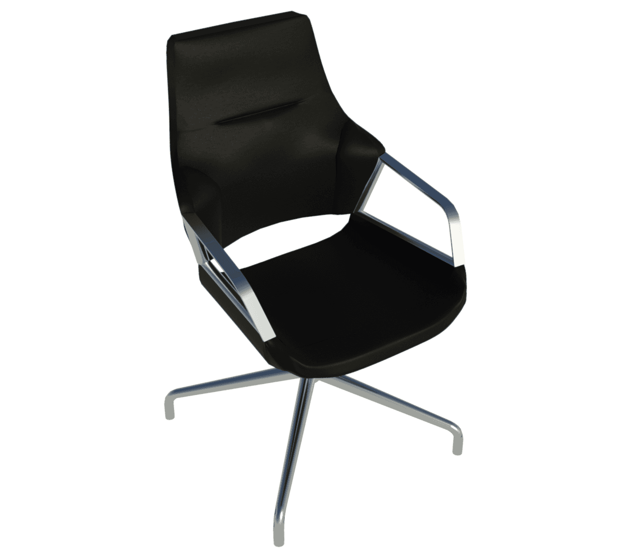
Raytrace of our Graph chair Revit family with black upholstery and bright chromium-plated frame.
About Wilkhahn
Wilkhahn is an office furniture manufacturer from Germany with over 60 years of experience. The company is a pioneer not only in office design, but also in setting standards for a socio-ecological approach to office furniture. A winner of the German Environmental Prize, Wilkhahn has been practicing environmental responsibility for over 20 years.
While there are numerous furniture manufacturers who do not have any Revit content available, Wilkhahn is not one of them. They already have Revit families available for some of their products, including the Graph chair.
However, after reviewing their content, we wanted to try our hand at creating a version of the Graph chair with superior visualization and Revit performance. We think you’ll like what we’ve been able to achieve.
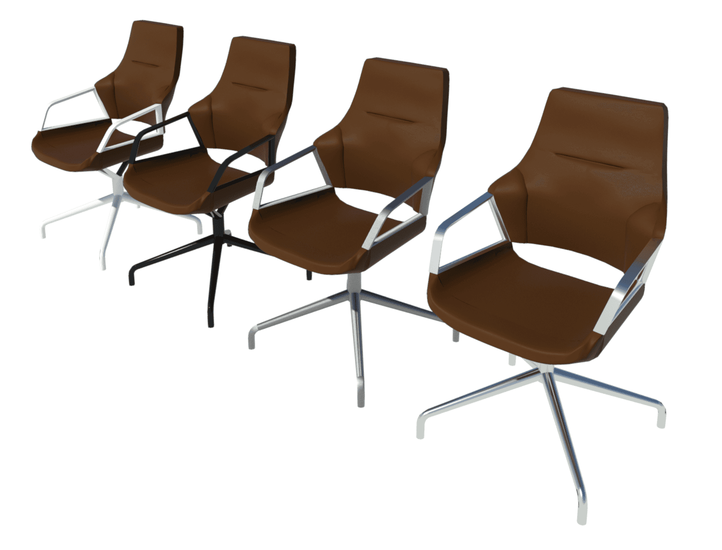
Revit Raytrace showing the Mandel Brown upholstered chair with four material options for the frame. Left to right: Coated White, Coated Black, Matt Polished and Bright Chromium-Plated.
Get the collection here
Rebuilt using Revit adaptive components
The most important choice we made in building our reworked version of the Graph chair was to use a Revit adaptive template. This allows for modeling curvatures and organic forms that would otherwise be impossible with standard Revit geometries such as extrusions, blends or sweeps.
Despite the obvious aesthetic benefits, adaptive components do come with a slight cost in terms of file size. In this case, that’s a tradeoff worth making as visualization is incredibly important when it comes to interior design. The realism and graphic appeal that you can achieve with an adaptive component far outweigh the limited increase in file size.
As further evidence for this approach, our reworked version of the Graph chair still ended up being 60% smaller in file size than the manufacturer’s version. Wilkhahn’s existing Revit family for this particular chair model – 301/5 with a four-star base – has a file size of 2.5MB. That is quite heavy, especially considering it’s made from standard Revit geometry, which leaves sharp edges and subpar detailing. On the other hand, our version comes in at just 1MB, despite using a “heavier” adaptive component.
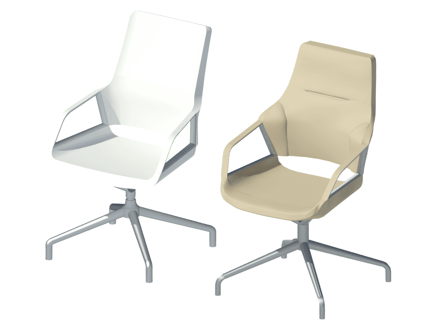
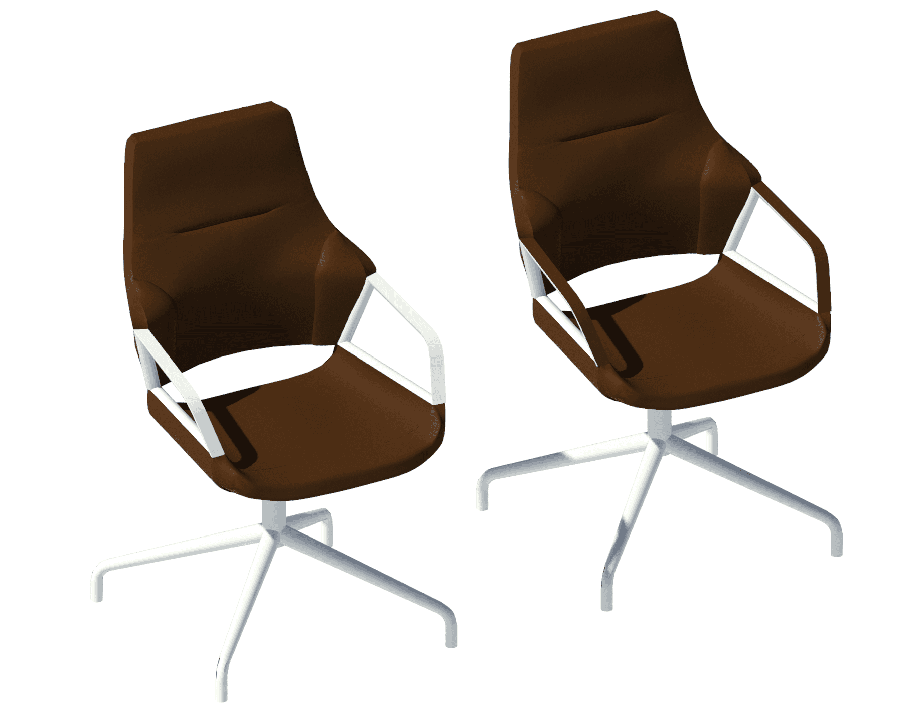
Manufacturer Revit family (left) and our reworked Graph chair in beige-brown upholstery (right).
Improved visualization in 2D and 3D
The image above shows the original Wilkhahn Graph chair on the left and our rebuild on the right. The actual chair costs over £2000, but the manufacturer’s family doesn’t pay enough attention to what makes the Graph chair special, namely its mix of undulating and clean forms.
With the original family, the eye of the interior designer is not drawn toward the chair’s seat, which appears flat and washed out. Instead, it's drawn towards the chair frame, and in particular, to the revolve geometry connecting the legs and seat — see below.
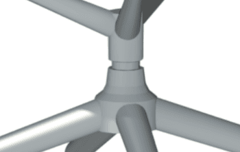
Over-detailing of the frame geometry in the original Revit family.
The manufacturer's family uses 2D geometry in plan view, which is a good thing. Having separate 2D and 3D geometry not only improves model performance in 2D views, but it also provides a chance to show different information and create representations suited to different contexts.
However, instead of following what’s represented on the manufacturer’s datasheet and brochures, the original family's 2D plan view simply follows the 3D geometry from the content creator. As shown in the image below, this results in added linework around the legs/feet and a less accurate representation of the seat and armrests.
In contrast, our 2D geometry emulates what is seen on Wilkhahn's own brochure for the Graph chair. This creates a stronger relationship and consistency between product documentation and Revit files, as well as more accurate imagery and less linework. Thus, file size is reduced and project end results, such as sheet deliverables, will be improved.
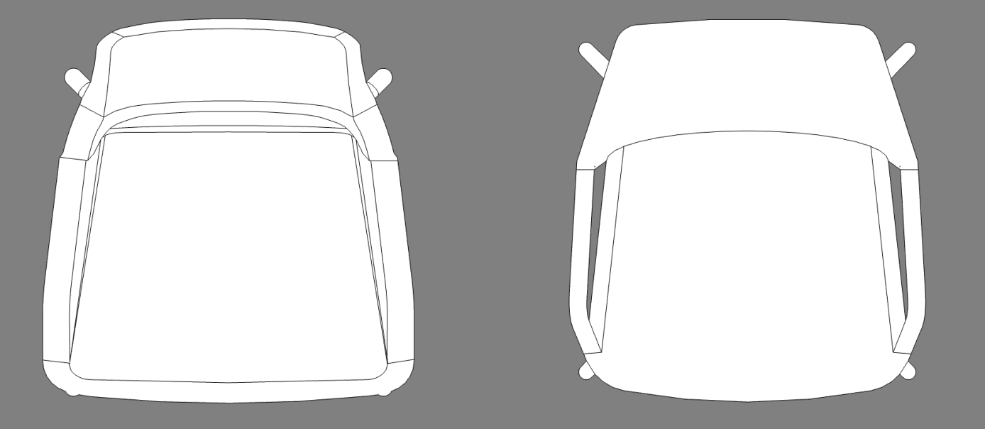
Revit plan view showing original (left) and reworked (right) chairs.
Easy-to-manage range of materials and colors
Our rebuild of the Graph chair Revit family comes with the standard four-star leg base, glides, and a selection of the more popular materials and finishes. The family contains over 40 different types and uses a type catalog for simplified management.
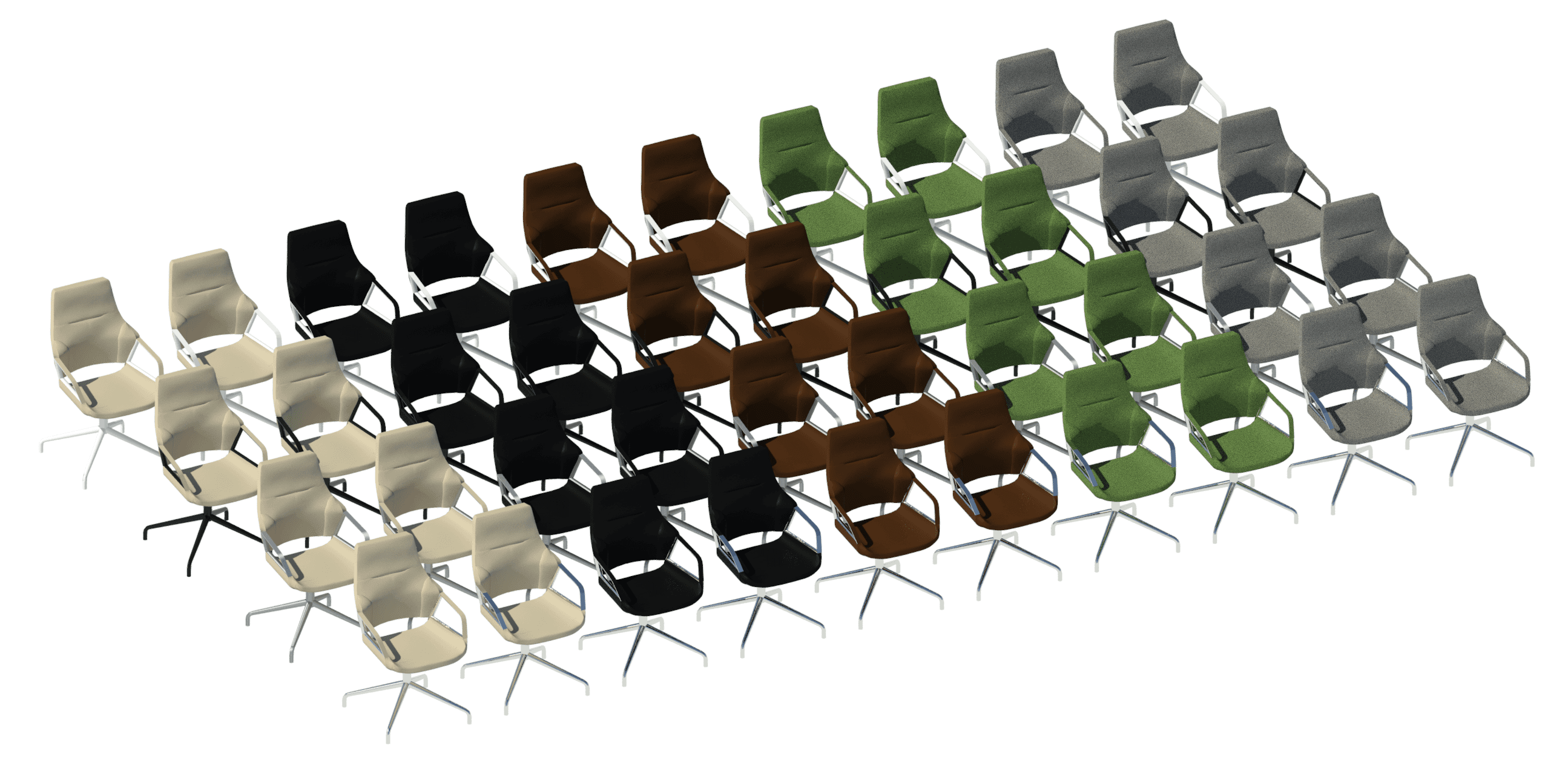
Raytrace showing all 40 types of our rebuilt Graph chair Revit family.
Raytrace showing armrest material options.
While it’s great that Wilkhahn already provide Revit content for their office furniture, the Graph chair is a contemporary classic that deserves a Revit family capable of bringing its remarkable design to life. Our rebuilt version, made with interior designers in mind, offers beautiful and realistic visualization, and works like a charm for Revit project documentation and delivery. We hope you’ll try it out for yourself soon.

In the past, we've worked a lot on iconic chairs from the 20th century, such as the Butaca Granada and the Tulip Chair. This week’s free collection showcases a 21st century classic chair, this time from the world of office and conference furniture.
The Graph chair from Wilkhahn was designed by Markus Jehs and Jürgen Laub and its name refers to its graphical aesthetic. The chair can be found in executive offices and sleek conference rooms all around the world, and apparently even in outer space aboard the USS Enterprise.
Read on to learn more about our version of the Graph chair and its use of Revit adaptive components, or click here to get the free Revit family.

Raytrace of our Graph chair Revit family with black upholstery and bright chromium-plated frame.
About Wilkhahn
Wilkhahn is an office furniture manufacturer from Germany with over 60 years of experience. The company is a pioneer not only in office design, but also in setting standards for a socio-ecological approach to office furniture. A winner of the German Environmental Prize, Wilkhahn has been practicing environmental responsibility for over 20 years.
While there are numerous furniture manufacturers who do not have any Revit content available, Wilkhahn is not one of them. They already have Revit families available for some of their products, including the Graph chair.
However, after reviewing their content, we wanted to try our hand at creating a version of the Graph chair with superior visualization and Revit performance. We think you’ll like what we’ve been able to achieve.

Revit Raytrace showing the Mandel Brown upholstered chair with four material options for the frame. Left to right: Coated White, Coated Black, Matt Polished and Bright Chromium-Plated.
Get the collection here
Rebuilt using Revit adaptive components
The most important choice we made in building our reworked version of the Graph chair was to use a Revit adaptive template. This allows for modeling curvatures and organic forms that would otherwise be impossible with standard Revit geometries such as extrusions, blends or sweeps.
Despite the obvious aesthetic benefits, adaptive components do come with a slight cost in terms of file size. In this case, that’s a tradeoff worth making as visualization is incredibly important when it comes to interior design. The realism and graphic appeal that you can achieve with an adaptive component far outweigh the limited increase in file size.
As further evidence for this approach, our reworked version of the Graph chair still ended up being 60% smaller in file size than the manufacturer’s version. Wilkhahn’s existing Revit family for this particular chair model – 301/5 with a four-star base – has a file size of 2.5MB. That is quite heavy, especially considering it’s made from standard Revit geometry, which leaves sharp edges and subpar detailing. On the other hand, our version comes in at just 1MB, despite using a “heavier” adaptive component.

Manufacturer Revit family (left) and our reworked Graph chair in beige-brown upholstery (right).
Improved visualization in 2D and 3D
The image above shows the original Wilkhahn Graph chair on the left and our rebuild on the right. The actual chair costs over £2000, but the manufacturer’s family doesn’t pay enough attention to what makes the Graph chair special, namely its mix of undulating and clean forms.
With the original family, the eye of the interior designer is not drawn toward the chair’s seat, which appears flat and washed out. Instead, it's drawn towards the chair frame, and in particular, to the revolve geometry connecting the legs and seat — see below.

Over-detailing of the frame geometry in the original Revit family.
The manufacturer's family uses 2D geometry in plan view, which is a good thing. Having separate 2D and 3D geometry not only improves model performance in 2D views, but it also provides a chance to show different information and create representations suited to different contexts.
However, instead of following what’s represented on the manufacturer’s datasheet and brochures, the original family's 2D plan view simply follows the 3D geometry from the content creator. As shown in the image below, this results in added linework around the legs/feet and a less accurate representation of the seat and armrests.
In contrast, our 2D geometry emulates what is seen on Wilkhahn's own brochure for the Graph chair. This creates a stronger relationship and consistency between product documentation and Revit files, as well as more accurate imagery and less linework. Thus, file size is reduced and project end results, such as sheet deliverables, will be improved.

Revit plan view showing original (left) and reworked (right) chairs.
Easy-to-manage range of materials and colors
Our rebuild of the Graph chair Revit family comes with the standard four-star leg base, glides, and a selection of the more popular materials and finishes. The family contains over 40 different types and uses a type catalog for simplified management.

Raytrace showing all 40 types of our rebuilt Graph chair Revit family.

Raytrace showing armrest material options.
While it’s great that Wilkhahn already provide Revit content for their office furniture, the Graph chair is a contemporary classic that deserves a Revit family capable of bringing its remarkable design to life. Our rebuilt version, made with interior designers in mind, offers beautiful and realistic visualization, and works like a charm for Revit project documentation and delivery. We hope you’ll try it out for yourself soon.
Kinship
The best way to manage Revit content
Kinship
The best way to manage Revit content
Kinship
The best way to manage Revit content
Similar Articles
Never miss an update with our monthly newsletter
Get the latest company news, product updates, blog posts and free Revit content from Kinship. Delivered directly to your inbox no more than once a month.
By submitting your email, you agree to receive newsletter emails.
Support
Never miss an update with our monthly newsletter
Get the latest company news, product updates, blog posts and free Revit content from Kinship. Delivered directly to your inbox no more than once a month.
By submitting your email, you agree to receive newsletter emails.
Support
Never miss an update with our monthly newsletter
Get the latest company news, product updates, blog posts and free Revit content from Kinship. Delivered directly to your inbox no more than once a month.
By submitting your email, you agree to receive newsletter emails.
Support


